01. The Mies: The Glass Corner Plan
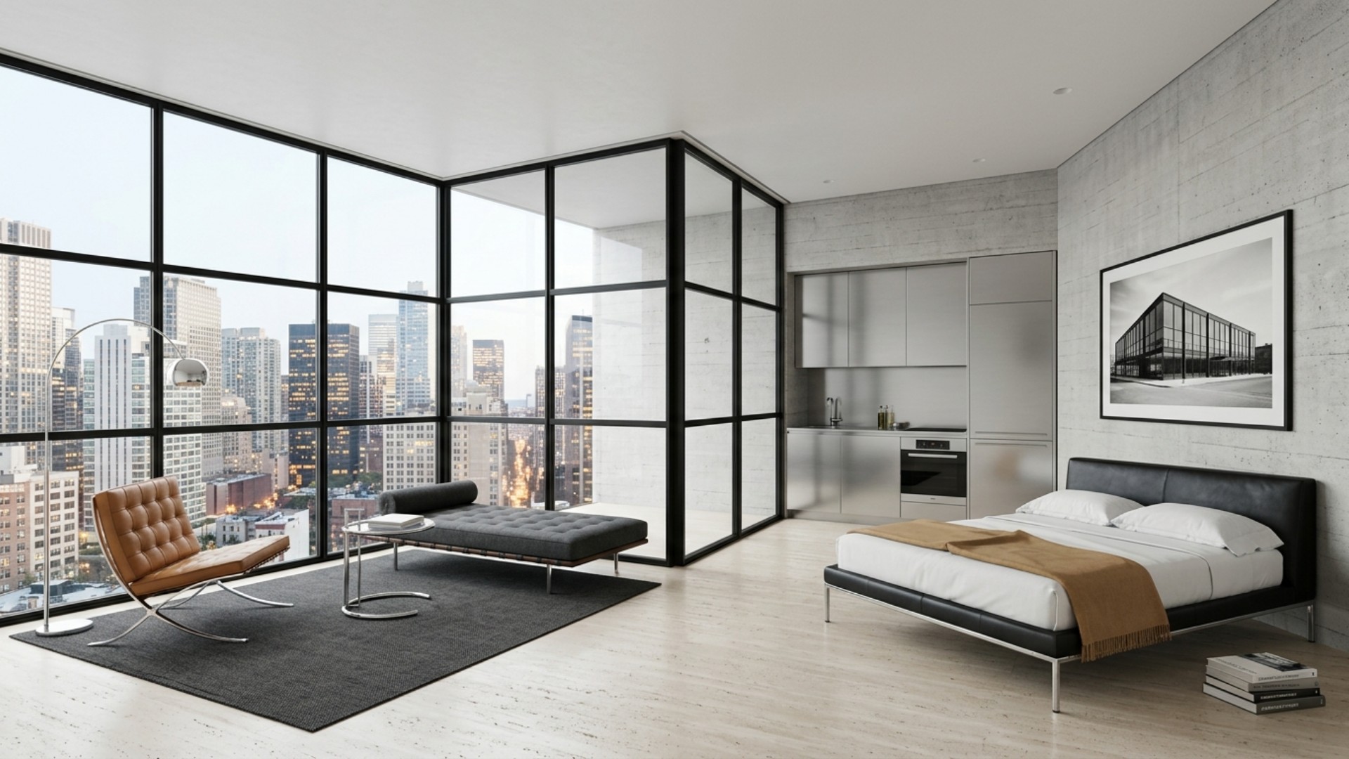
Inspired by Ludwig Mies van der Rohe
Mies van der Rohe said it best: less is more. His approach to the studio apartment is radical in its simplicity: no walls, no partitions, no apology. The entire 400 square feet is one continuous open space, with a glass corner as the visual anchor. Everything else recedes.
The layout: The bed sits as a low platform against the left wall, separated from the living zone not by walls but by a single Barcelona daybed that acts as a visual threshold. The kitchen occupies a slim strip along the right wall, all brushed steel and integrated panels. The bathroom is tucked behind the only enclosed wall.
Why it works: By refusing to carve the space into smaller pieces, the apartment feels twice its size. The glass corner floods the space with light and creates the illusion of depth. The trick is discipline: every object must earn its place. Palette: cool gray, chrome, warm cream, polished concrete.
02. The Muji: The Quiet Compartment
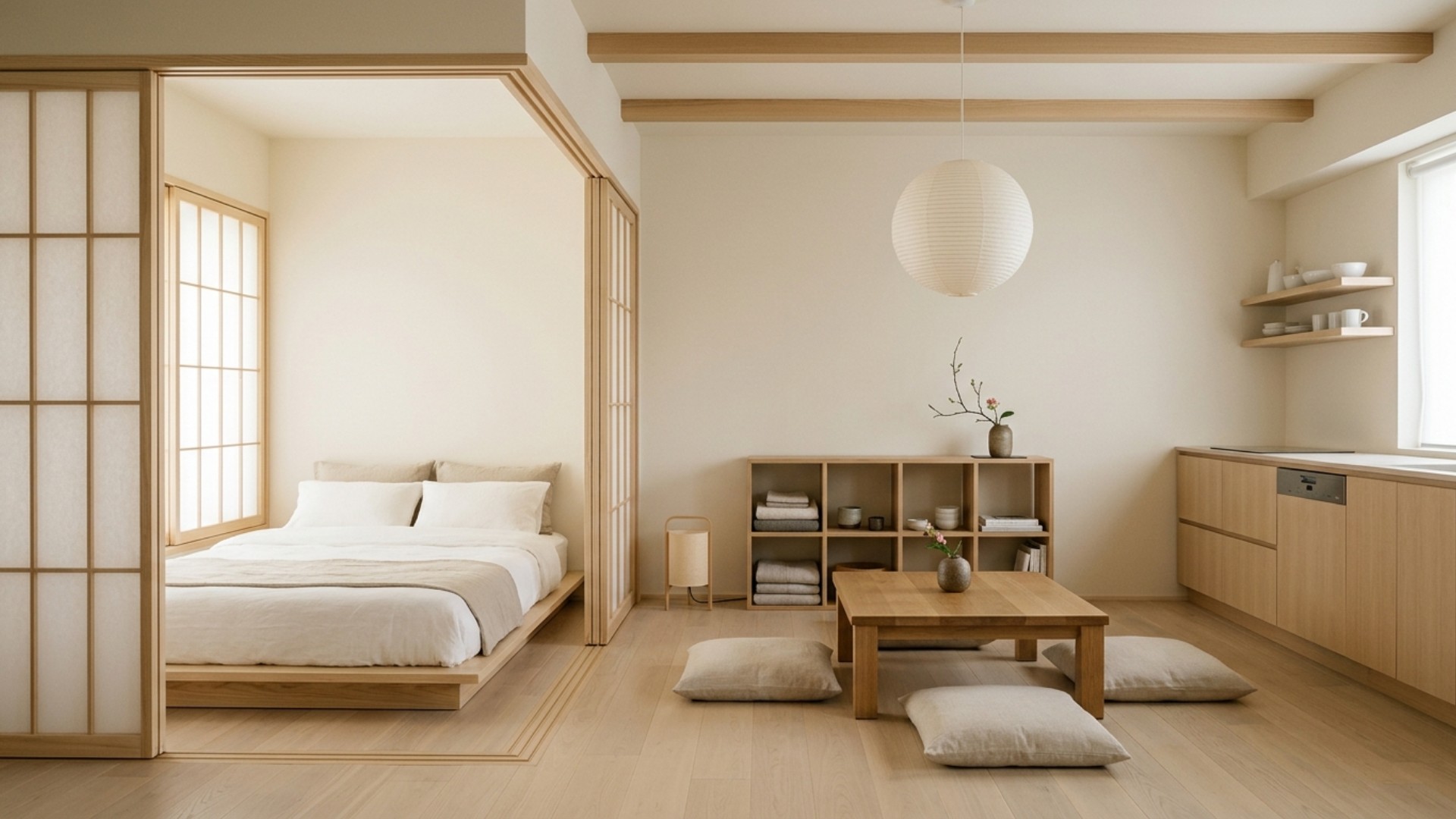
Inspired by Naoto Fukasawa & Muji
The Japanese design philosophy of ma (meaningful empty space) is perhaps the most useful idea you can bring to a studio apartment. It reframes the problem entirely: the goal isn't to fill the space, it's to leave the right parts empty.
The layout: Two sliding shoji-style screens divide the apartment into soft zones without ever closing it off completely. The sleeping zone sits behind the screens to the left, with a low platform bed in white linen. The kitchen is a compact run of pale oak cabinetry along the right wall, with a small dining table that tucks flush against it.
Why it works: The screens allow light to pass through while creating a psychological boundary between sleep and life. In the morning, sliding them open transforms the bedroom into an extension of the living space. At night, sliding them closed creates a sleep sanctuary in a room with no door. Palette: warm cream, pale oak, natural linen, woven rattan.
03. The Loft: The Stacked Plan
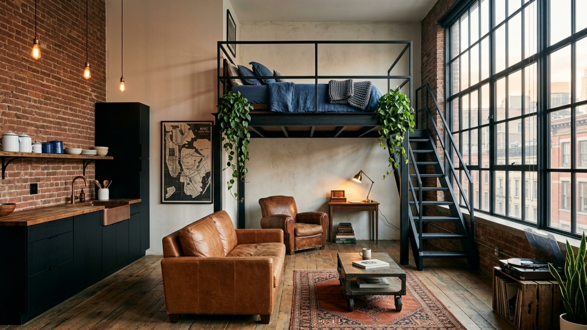
Inspired by New York's Soho Factory era
If you're going to live small, live vertical. The stacked plan does what almost no other studio layout dares to do: it treats the floor plan as two floors, using every inch of ceiling height to create a sleeping loft above the kitchen zone. The result is a studio that functions like a two-level apartment in a single room.
The layout: A steel-frame sleeping platform spans the kitchen and bathroom zones at approximately six feet of height. The kitchen occupies the ground level beneath the loft, compact and dramatic, lit by the warm glow above. A slim steel ladder provides access. The remaining floor is entirely open, a generous living room for a studio its size.
Why it works: Climbing to bed is a ritual, not just a movement. The ground floor feels expansive because the bedroom has been lifted off it entirely. This layout works best in apartments with ceilings above nine feet. Palette: dark charcoal, rust orange, raw concrete, aged brass.
Wondering if your ceilings could take a loft? Upload a photo of your studio to Framehouse and see the stacked plan rendered in your actual room before you commit to a single bolt. Free to start.
04. The Parisian: The Jewel Box
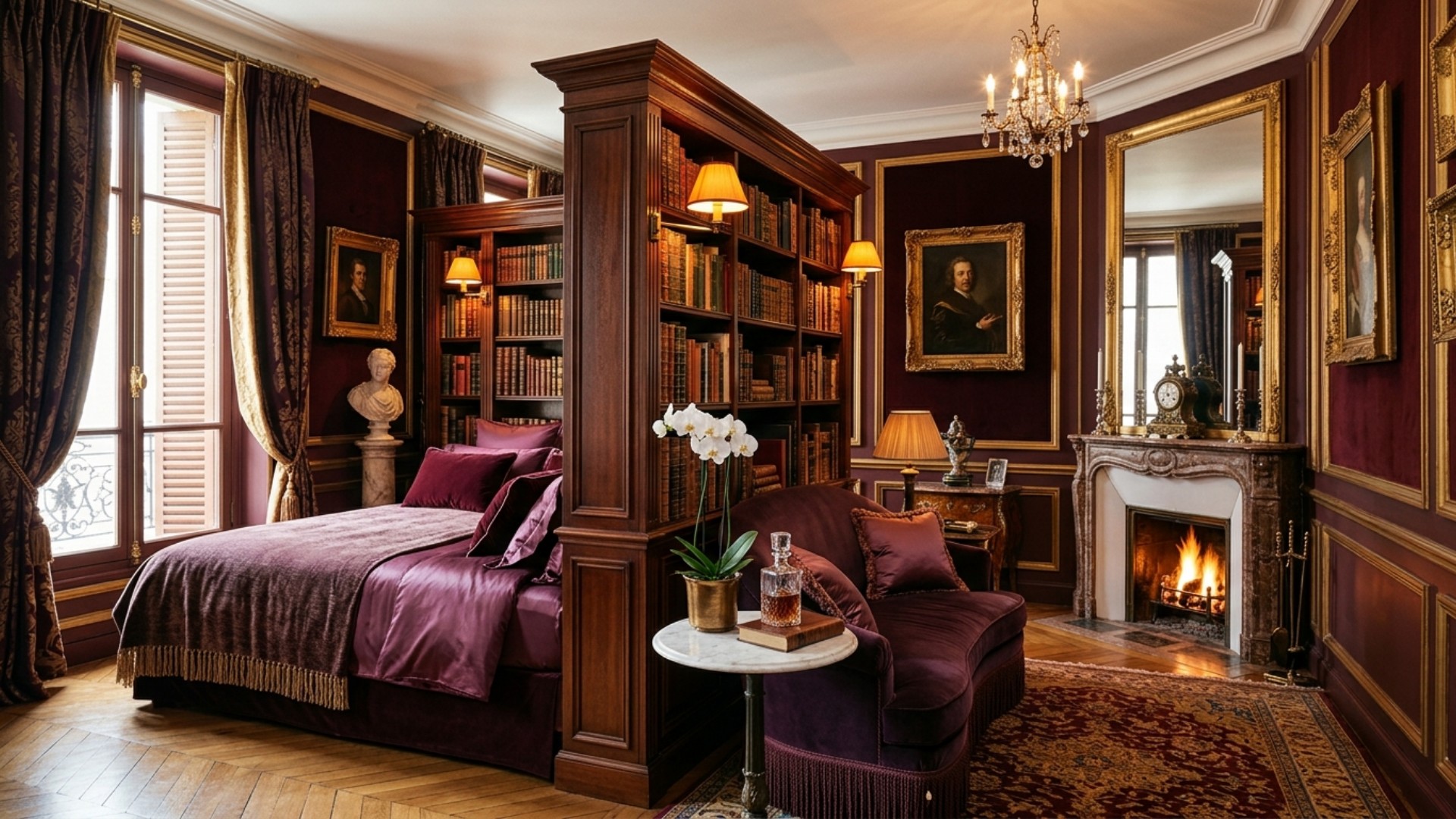
Inspired by Jacques Garcia
Jacques Garcia, designer of the Hôtel Costes, has never met a surface he didn't want to make beautiful. His answer to the small apartment is not restraint but intention: fill every corner, but fill it perfectly. The Parisian layout is the studio apartment as cabinet of curiosities.
The layout: A floor-to-ceiling bookshelf unit acts as the room divider between sleeping and living, providing privacy, storage, and beauty all at once. The bed lives behind the books. The living zone faces an emerald feature wall. A small marble bistro table and two chairs occupy the kitchen corner, doubling as dining room.
Why it works: The bookshelf divider is the masterstroke: it creates a bedroom without walls, a library without a dedicated room, and an extraordinary visual moment for anyone who walks in. The key rule: everything must be beautiful. No flat-pack, no temporary. Palette: deep emerald, dusty rose, antique gold, herringbone parquet.
05. The Hygge: The Loop
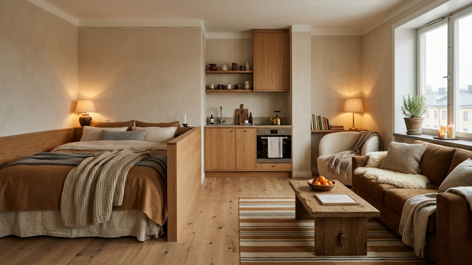
Inspired by Ilse Crawford
Ilse Crawford designs for how spaces feel, not just how they look. Her design principle, that a room should support the rituals of daily life, translates perfectly to the studio. The Hygge layout organizes the space not around zones but around moments: the morning coffee, the evening read, the long Sunday sleep-in.
The layout: The bed anchors the back corner, positioned to catch morning light. A deep window-seat reading nook is carved out of the adjacent corner, just wide enough for a person and a blanket. A round wool rug creates a circular gathering space in the center. The path through the apartment forms a natural loop: bed to kitchen to sofa to nook and back.
Why it works: The loop means there is no dead end in the apartment. You are always moving through it, not into it. The reading nook gives the studio a room it technically doesn't have. Layered textiles, amber light, and warm wood do the rest. Palette: terracotta, warm sage, oat linen, burnished amber.
06. The Brooklyn: The Corner Anchor
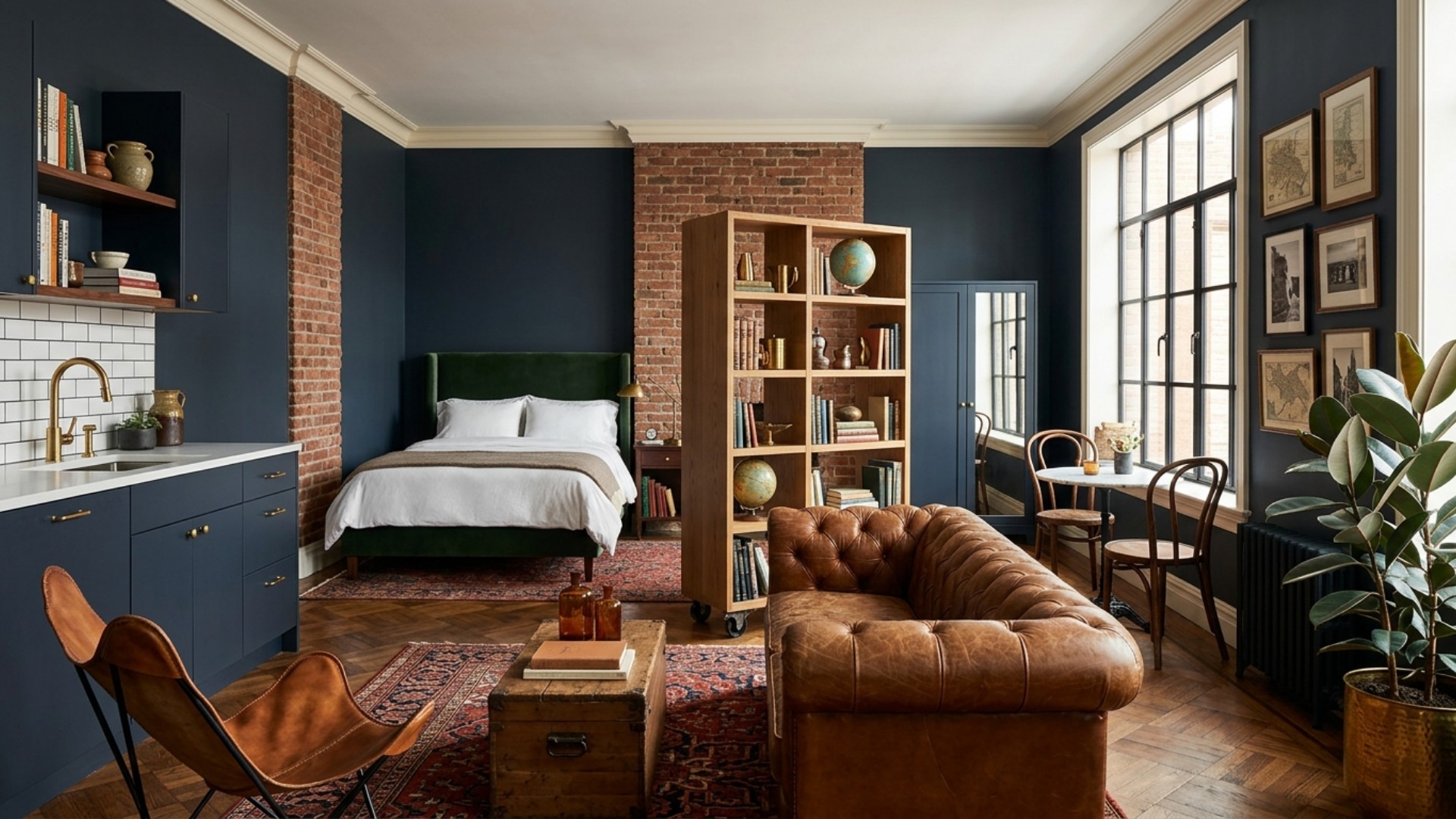
Inspired by Roman and Williams
Robin Standefer and Stephen Alesch of Roman and Williams make spaces that feel lived-in before you've moved a single object in. Their secret is anchoring furniture to the corners, treating the corner not as dead space but as the most powerful spot in the apartment.
The layout: The sofa anchors the living zone against the left wall, facing a low credenza and leaning art. The bed is positioned in the diagonally opposite corner, separated from the living zone by a single open bookcase on casters. The dining zone, just a small round table with two mismatched chairs, occupies the window corner.
Why it works: Pulling furniture to the corners makes the center of the room feel generous and navigable. The caster bookcase can be repositioned, providing privacy some nights, openness on others. The mismatched chairs are deliberate: this is a home, not a showroom. Palette: deep navy, exposed brick, forest green, aged brass.
Halfway through the list and torn between two plans? Let Framehouse redesign your studio from one photo and compare your favorites side by side in minutes.
07. The Tokyo Fold: The Transforming Plan
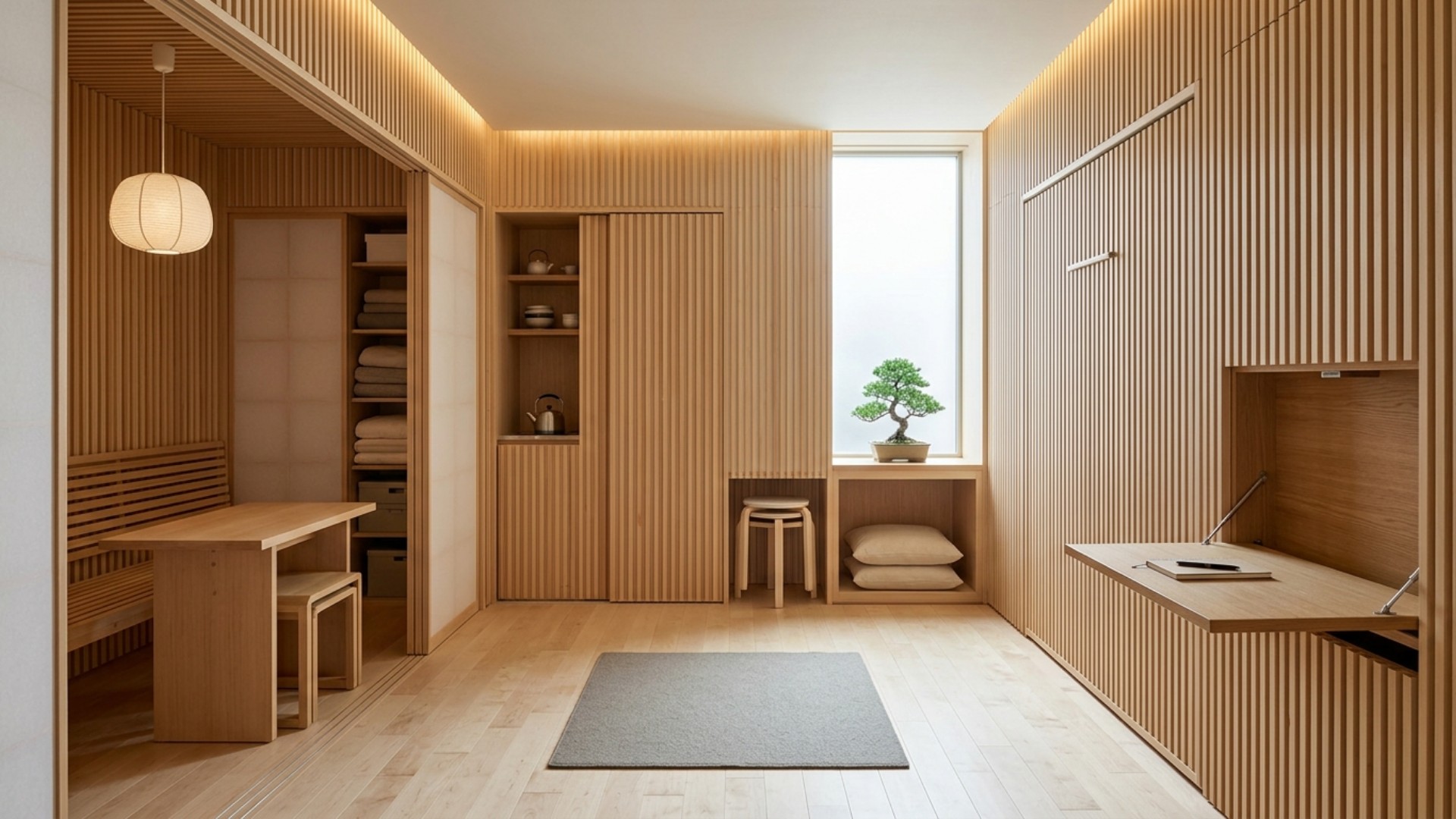
Inspired by Kengo Kuma
Japanese architects have spent decades solving the micro-apartment problem. Kengo Kuma's approach is to treat the apartment not as a fixed space but as a kit of parts: surfaces and functions that fold, slide, and reveal themselves as needed. The Tokyo Fold is a studio that is a different room depending on the time of day.
The layout: A full-height wall unit along the left wall contains everything: a Murphy bed that folds down from a seamless panel, a fold-out oak desk with integrated shelving, a compact kitchen with hidden appliances behind panel doors, and a wardrobe. When the bed is folded up, the floor is completely empty. The apartment becomes a living room, a studio, a yoga space.
Why it works: The wall unit discipline means the apartment never feels cluttered: everything has a designated place to disappear to. The floor is the most valuable surface in a small apartment. Don't waste it. Palette: crisp white, natural birch, pale stone, soft moss.
08. The Palm Springs: The Pool House Plan
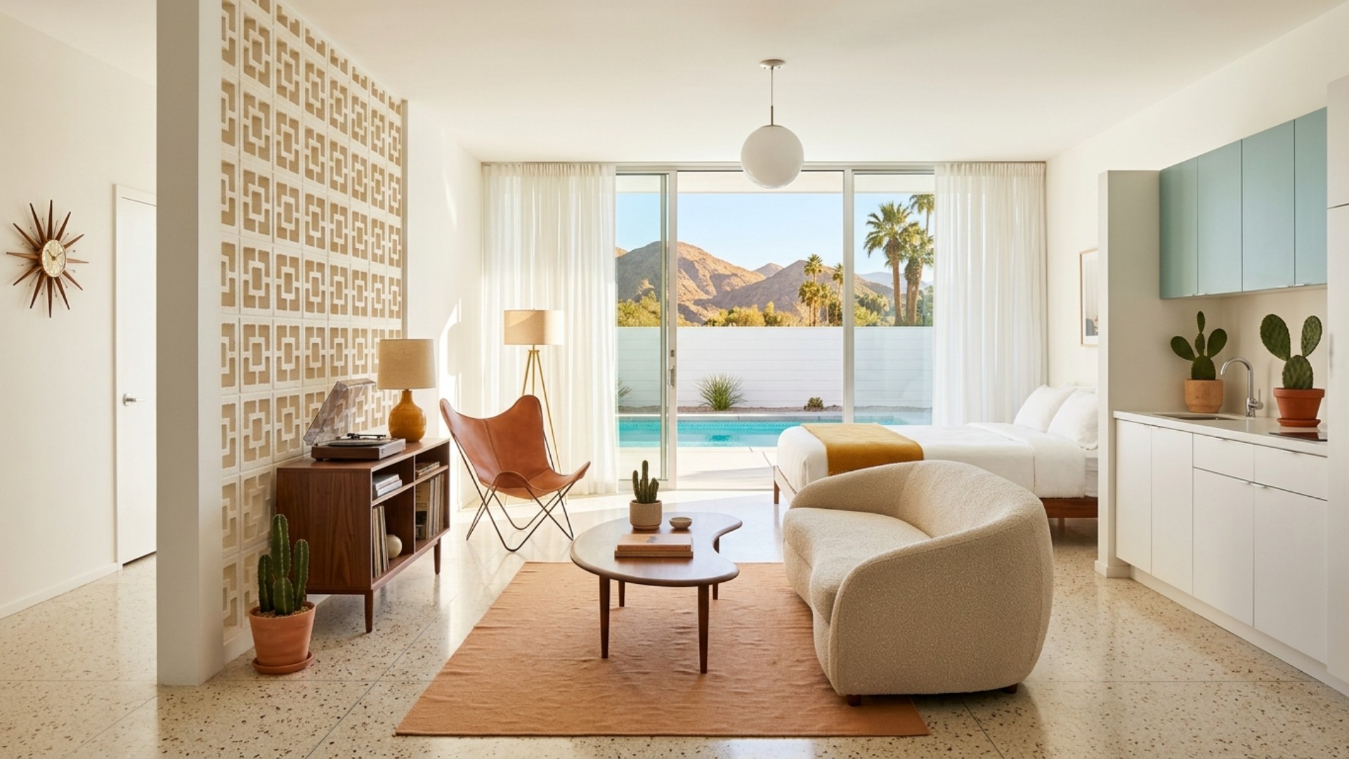
Inspired by Albert Frey & William Cody
The desert modernists of Palm Springs solved a very specific brief: how do you make a small house feel like paradise? Their answer was the sliding glass wall, bringing the outside in and doubling the apparent size of the space without adding a single square foot.
The layout: The bed is positioned to face the sliding glass wall, the most important move in this plan. Waking up to the view, not a blank wall, changes the entire psychology of the apartment. Terrazzo flooring creates a continuous surface that flows visually into the exterior. The living zone, a curved sofa and a kidney-shaped coffee table, floats in the center of the space.
Why it works: This layout is built around a single luxury: the glass door. If your apartment has direct exterior access, this is the plan. The terrazzo floor and curved mid-century furniture create a space that feels perpetually sun-drenched regardless of weather. Palette: mint green, terracotta orange, blush pink, cream terrazzo.
09. The Gallery: The Art Wall Plan
Inspired by Piero Lissoni
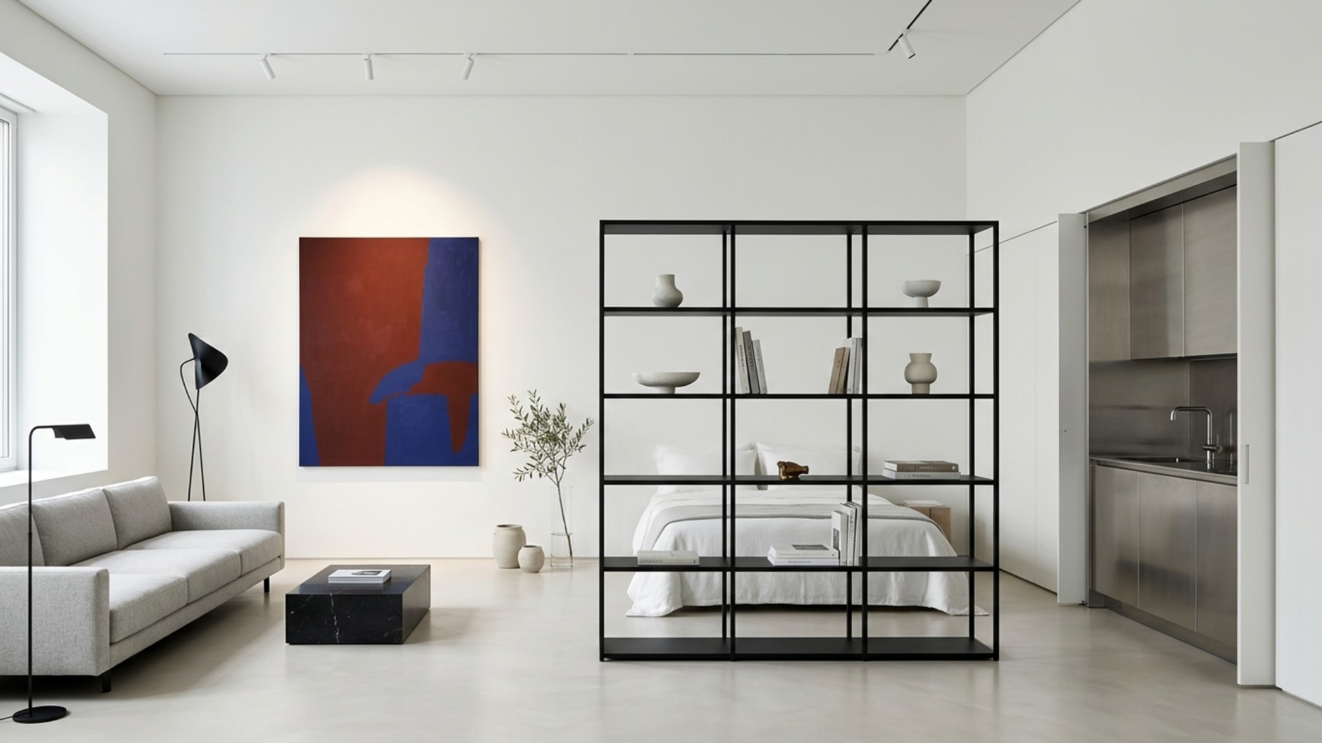
Piero Lissoni makes spaces that feel resolved, calm, inevitable. His Italian rationalism insists that every element earns its presence through both beauty and function. In the Gallery layout, a single freestanding shelving wall does the work of an entire architectural intervention.
The layout: A freestanding open shelving unit, seven feet tall and four feet wide, sits perpendicular to the back wall, dividing the apartment into a living zone at the front and a sleeping zone behind. It carries books and objects on the living side and faces a single statement artwork toward the bedroom. The kitchen is integrated flush into one wall, invisible until you open the panels.
Why it works: The freestanding divider creates privacy without closing off the space, provides storage without bulk, and creates a visual destination, something to move toward when you enter. One great object can do everything. Palette: warm concrete, terracotta red, off-white, single bold artwork.
Curious whether the art wall would survive contact with your actual floor plan? See your studio reimagined with Framehouse, then get the design playbook that makes it real.
10. The Bauhaus: The Grid Plan
Inspired by Marcel Breuer & Herbert Bayer
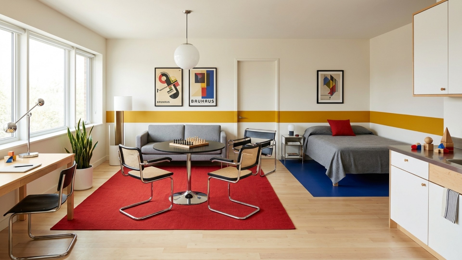
The Bauhaus school believed that art and function were inseparable: that a chair could be both a sculpture and a tool, that a floor plan could be both a diagram and a painting. The Grid Plan applies this thinking directly: it uses primary colors to define functional zones, making the layout of the apartment readable, even joyful, at a glance.
The layout: The apartment is divided into a strict three-zone grid. The sleeping zone (top-left) is defined by a bright yellow area rug. The living zone (center) is anchored by a red accent wall. The dining zone (top-right corner) is defined by a cobalt blue painted nook. The kitchen occupies the bottom strip, white and functional. Tubular steel Breuer chairs and a Wassily chair in black leather connect the zones.
Why it works: Color zoning does the work that walls usually do: creating the psychological sense of separate rooms without any physical division. It's also flexible: moving the rugs and repainting changes the entire apartment layout. A studio you can rearrange with a paintbrush. Palette: primary red, primary yellow, primary blue, black steel, white.
11. The Jungle: The Living Wall Plan
Inspired by Kelly Wearstler
Kelly Wearstler's spaces are always a little overwhelming in the best possible way: a density of texture, pattern, and life that makes you feel like you've arrived somewhere. The Jungle layout applies this maximalist energy to the problem of studio division: instead of walls or screens, it uses plants.
The layout: A row of tall planters (fiddle-leaf figs, monstera deliciosa, trailing pothos from ceiling hooks) creates a living green wall that divides the sleeping zone from the living area. It is not a solid wall; light passes through it, the bedroom and living room are aware of each other. But it is unmistakably a threshold. An emerald velvet sofa, rattan pendant lamp, and a leopard-print rug anchor the living zone.
Why it works: Plants as architecture is one of the oldest design moves in the world. Here it's applied to the smallest urban apartment: a private jungle that also cleans your air and requires you to develop a daily watering practice, which is, incidentally, a very good way to slow down. Palette: hunter green, warm rattan, terracotta, aged gold, tropical botanical.
12. The Capsule: The One-Wall Plan
Inspired by Charlotte Perriand
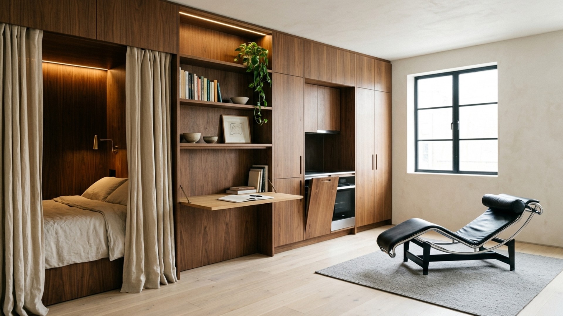
Charlotte Perriand was decades ahead of her time. Working alongside Le Corbusier in the 1920s and 30s, she designed built-in furniture systems that made small apartments feel not cramped but complete, as though the smallness was a feature, not a constraint. The Capsule is her answer, and it is still the best answer anyone has given.
The layout: One entire wall, floor to ceiling and wall to wall, contains everything. From left to right: a recessed bed alcove with a privacy curtain, a fold-down oak desk with integrated shelving, a compact kitchen with hidden appliances behind panel doors, and a full wardrobe. The other three walls are completely bare. The floor holds only a single low wool rug and a Le Corbusier chaise longue.
Why it works: By compressing all the utility into one wall, the Capsule liberates the floor entirely. The remaining space feels genuinely luxurious despite being identical in size to any other studio. This is the layout for anyone who believes that the simplest solution is always the most elegant one. Palette: warm walnut, off-white plaster, charcoal, natural wool.
Twelve plans, twelve personalities, one room. The fastest way to find yours is to stop squinting at floor plans and see your own studio wearing each look. Upload a photo of your studio to Framehouse and watch it reimagined in minutes, then get the complete design playbook with everything you need to make it real. Free to start, no designer appointment required.