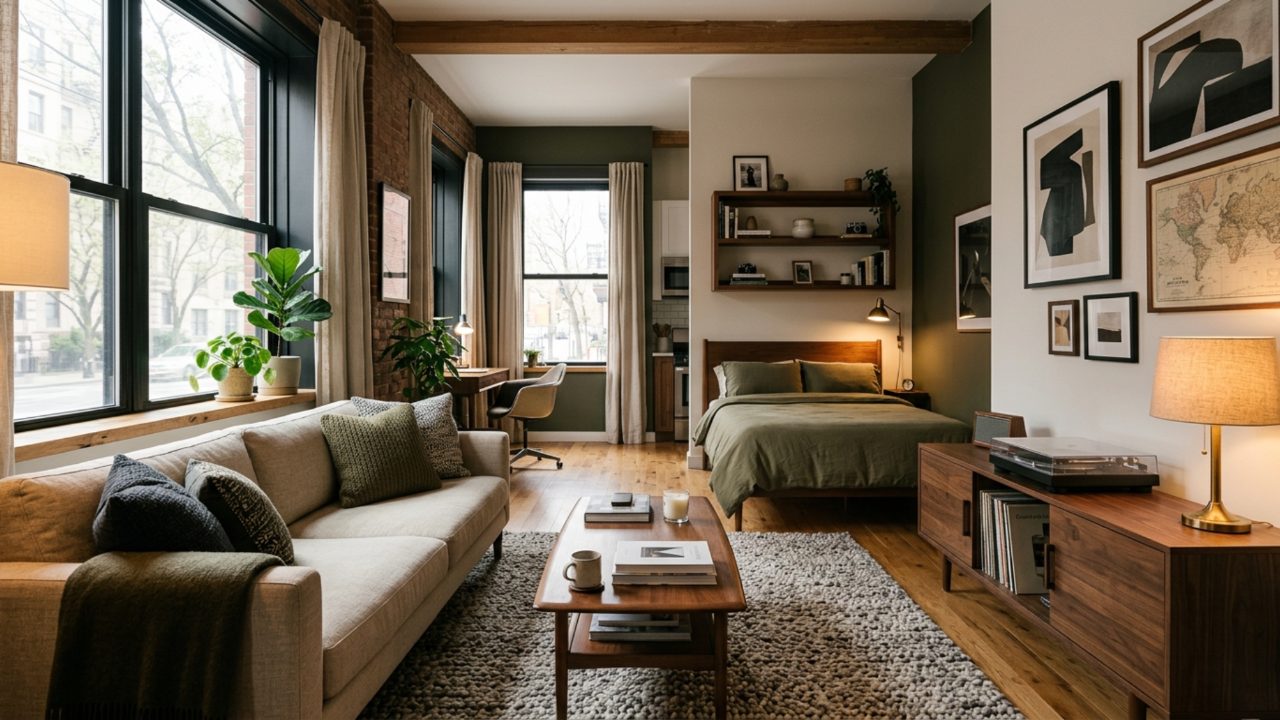
Somewhere along the way, the "guy's apartment" earned a bad reputation. Black leather everything, a neon sign glowing over the bed, a television the size of a garage door, and a coffee table that has clearly never met a coaster. It reads less like a home and more like the set of a movie about a man who peaked in college.
Your studio can do better, and so can you. A great small space for a guy is not about the biggest screen or the loudest statement. It is about warmth, texture, and a few smart moves that make one room feel like several. Here are the ideas that actually work, from palette to storage, with not a single cliché in sight.
None of this requires a renovation, a big budget, or permission from a landlord. It is mostly about editing what you already own and being deliberate about the few things you add.
Ditch the Bachelor-Pad Palette

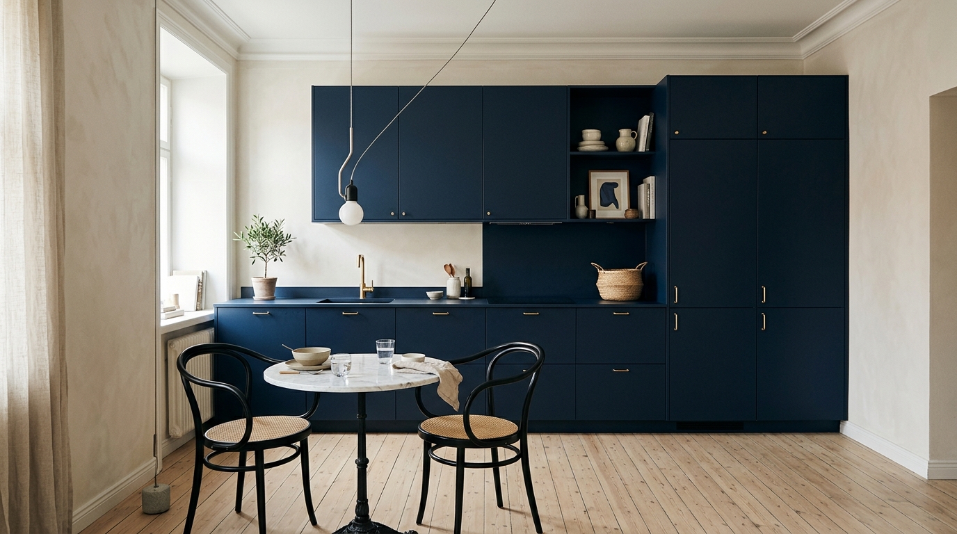
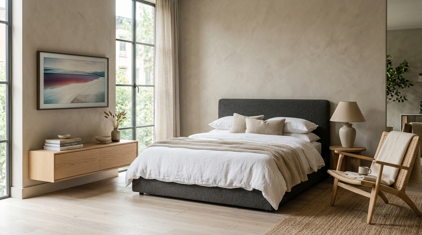
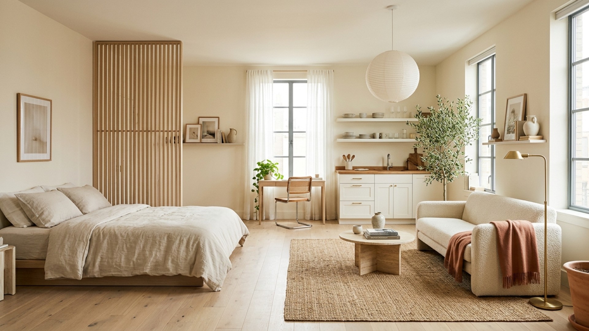
The fastest way to make a studio look grown-up is to retire the all-black, all-cool scheme and reach for warmth instead. Think oatmeal, greige, soft charcoal, and walnut, with a single deeper note like olive or rust to keep things from going bland. Warm neutrals reflect light, which makes a small room feel larger, and they age far better than a wall of moody navy ever will.
Keep the palette tight. Two or three core colors across the whole studio read as intentional, while ten competing shades read as chaos. Let texture carry the interest rather than color: a nubby linen sofa, a wool rug, a wood console. The result is calm, confident, and quietly expensive, which is exactly the impression you want when someone walks in.
If you want one shortcut, start with the biggest surfaces. Get the walls and the sofa into warm neutral territory, then let smaller pieces carry any bolder color. It is far easier to swap a thirty-dollar cushion than to repaint a whole studio, so keep your risks small and your commitments cheap.
Zone One Room Into Three

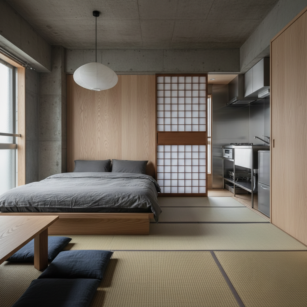
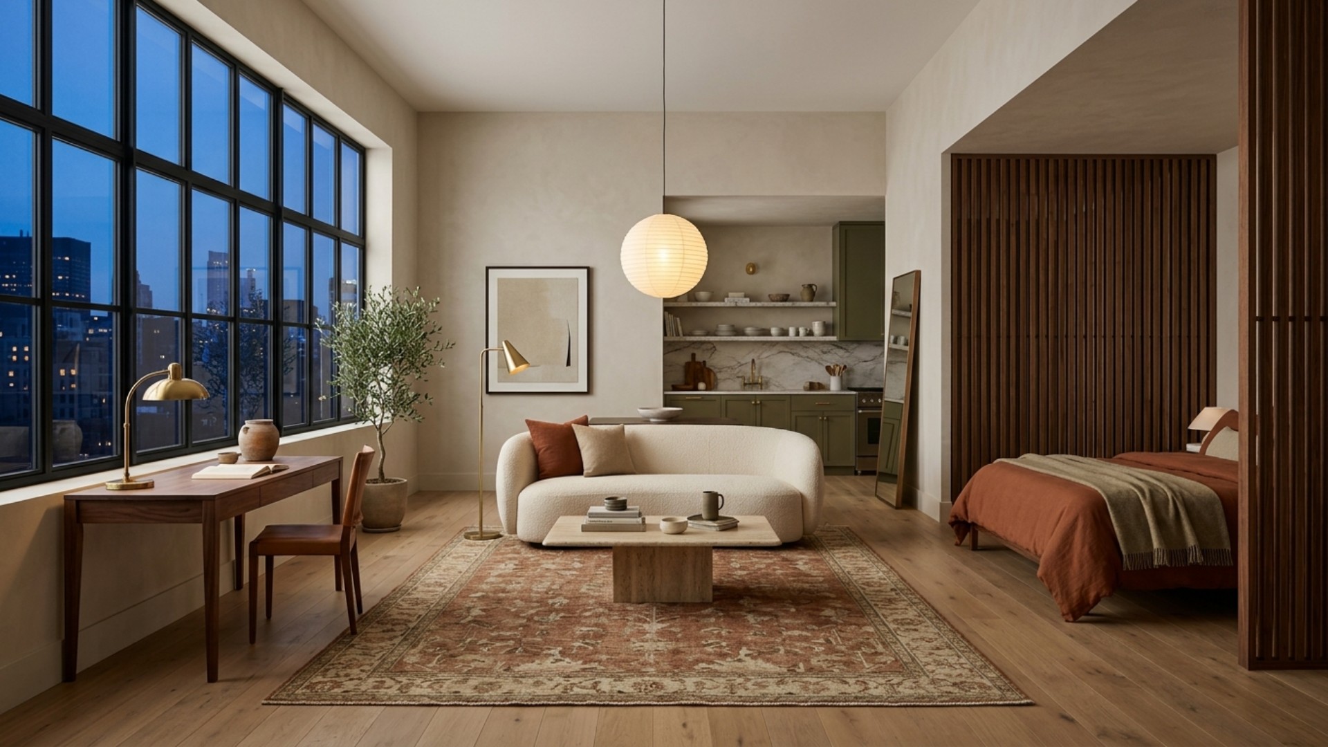
A studio is one room pretending to be a whole apartment, and your job is to help it keep up the act. Designers zone small spaces without building walls, using furniture, rugs, and low shelving to signal where one area ends and another begins. A large rug under the sofa says "living room." A second, smaller rug by the bed says "bedroom." Suddenly the eye reads two spaces instead of one crowded box.
A low bookshelf or an open-backed shelving unit makes a brilliant divider because it separates zones without blocking light. Float the sofa a few inches off the wall to define the living area, give each zone its own pool of lamp light, and let the bed live in its own corner. The trick is subtlety: you are suggesting boundaries, not building a maze.
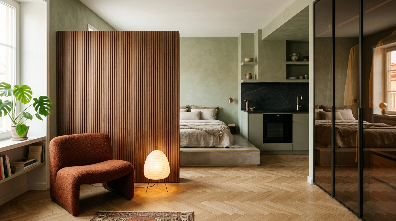
If your studio has an alcove or a jog in the wall, let it do the dividing for you. Tucking the bed into a natural recess is the closest a studio gets to a real bedroom, and it costs nothing but a little planning.
Loft the Bed, Reclaim the Floor

When square footage is scarce, the smartest direction to build is up. A lofted bed lifts the one thing that eats the most floor space and hands you back the room underneath, which becomes a desk nook, a reading corner, or serious storage. Modern loft frames have grown up too: slim steel, clean lines, and none of the summer-camp energy of the bunk you remember.
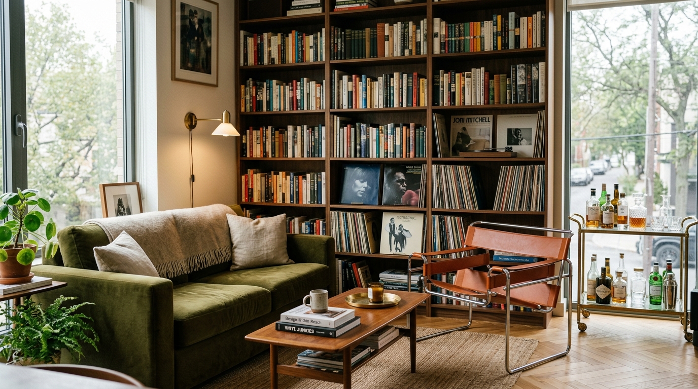
Not ready to loft? Go vertical everywhere else instead. Floor-to-ceiling shelving draws the eye upward and makes ceilings feel taller, while wall-mounted lamps and hooks keep surfaces clear. In a small space, every inch of wall is real estate, so use it before you crowd the floor with one more thing that lives at ankle height.
Whatever you lift, keep the pieces underneath low and open so the eye can travel all the way to the far wall. A tall, closed cabinet under a loft undoes the trick, while a slim desk or a pair of stools keeps the space breathing.
Texture Is the Real Masculine Move

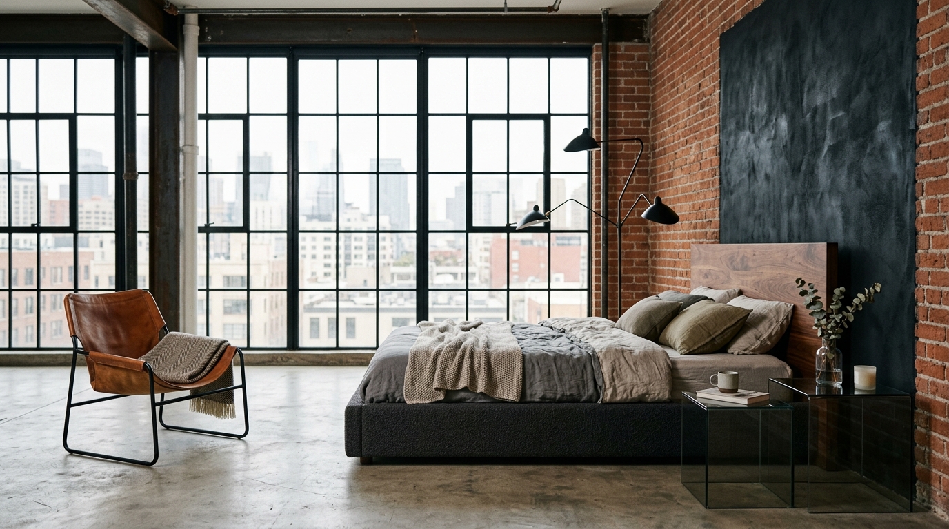
Here is the secret the black-leather crowd missed: masculine style lives in materials, not in darkness. Layer a cognac leather chair against a chunky wool throw, set walnut wood next to matte black metal, and add something handmade like a ceramic mug or a stoneware lamp. The contrast of smooth and rough, warm and cool, is what gives a room depth and character.
This is also where personality sneaks in without trying too hard. A stack of art and design books, a worn leather catch-all tray, one well-made object with a little patina. These read as a life lived, not a showroom staged. Texture is the quiet difference between a space that looks bought and a space that looks like yours.
Plants earn their keep here too. A single sculptural tree or a trailing vine softens all that wood and metal and adds the one thing a lot of guy spaces forget, which is a sign of something alive in the room.
One Statement Piece, Then Restraint

Every good room has a hero, and every small room can only afford one. Pick a single statement: a large piece of art above the sofa, a sculptural floor lamp, or one bold accent wall in deep olive or clay. Give it room to breathe and let everything else play a supporting role. This is where restraint beats the neon sign every time, because one confident choice says more than five loud ones.
Scale matters more than quantity in a studio. One big piece of art looks intentional, whereas a scattering of tiny frames looks nervous. The same goes for light: a couple of warm, well-placed lamps beat a single harsh ceiling fixture and instantly make the space feel like an adult actually lives there.
Whatever you crown as the hero, hang it at eye level and give it a generous margin of blank wall. Crowding a great piece with clutter is the fastest way to make it look ordinary.
Storage That Hides in Plain Sight

Nothing shrinks a studio faster than clutter, so the best storage is the storage you never see. Floating cabinets keep the floor clear and the walls working. Under-bed drawers swallow off-season clothes. A media console with doors hides the tangle of cables and controllers that otherwise announce themselves to every guest. The calmer your surfaces, the bigger and more considered the whole place feels.
The through-line across all of this is intention: warm colors, clear zones, vertical thinking, rich texture, one confident statement, and a place for everything. You do not need a designer or a bigger apartment to pull it off, you just need to see it before you commit. Upload a photo of your studio to Framehouse and watch it reimagined in minutes, then get the full design playbook to make it real.
Build a five-minute reset into your week while you are at it. When everything has a home, tidying is quick, and a studio that stays clear always photographs, and lives, larger than its actual square footage.
Frequently Asked Questions
How do you make a men's studio apartment look bigger? Stick to a warm, light neutral palette, keep the floor as clear as you can, and go vertical with shelving and wall-mounted lighting. Zoning with rugs and lifting the bed or key furniture off the ground both trick the eye into reading more space than there is.
What colors work best for a masculine small space? Warm neutrals like oatmeal, greige, and soft charcoal, grounded by walnut wood and one deeper accent such as olive, rust, or clay. They feel warm and grown-up, reflect light, and are far more livable than an all-black scheme.
How do you divide a studio without walls? Use a large rug to anchor the living area, a low open bookshelf as a divider, and thoughtful furniture placement to signal each zone. Floating the sofa off the wall and giving the bed its own corner makes one room read as several.
Do I need to hire a designer to pull this off? No. The moves here are simple and low-risk, and tools like Framehouse let you preview a full redesign from a single photo before you spend a dime, so you commit only once you love the plan.