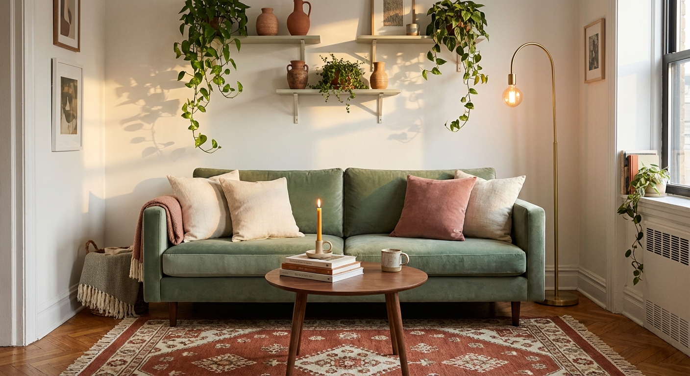
I spent three years in a 420 square foot studio in Brooklyn, and the first year was a disaster. I owned too much furniture, none of it was the right scale, and I had zero plan. Every Pinterest board I saved made me feel worse because nothing in those photos looked like my actual apartment with its radiator in the wrong place and one window facing a brick wall.
This guide exists because decorating a small apartment is a fundamentally different problem than decorating a large one. You cannot just buy smaller versions of the same furniture and call it done. Small spaces demand a system: measure first, zone second, buy last. When you skip those steps, you end up with a room that feels cluttered even when it is clean.
In this guide, you will learn how to plan a layout before you buy anything, how to choose furniture that actually fits, how to decorate every room on any budget, which renter-safe techniques actually work in 2026, how to avoid the five most common small apartment mistakes, and how AI design tools like Framehouse can show you the finished result before you spend a dollar.
Everything here is written from experience, tested in real apartments, and designed for renters who cannot drill into walls, paint over mistakes, or knock down a wall to solve a layout problem. Let's get into it.
According to Framehouse's original research surveying over 100 Americans about home design, 80% of people who want to redesign a room feel stuck, overwhelmed, or stressed before they even begin. This guide was built to fix that.
Ready to see what your room could look like?
Start fixing a room →Before You Decorate: Plan Your Layout First
The single biggest mistake renters make is buying furniture before they have a layout. In a large room, you can recover from a bad purchase by moving things around. In a small apartment, one oversized sofa can ruin the entire floor plan and there is nowhere to hide it. The layout is the foundation. Everything else, your style, your color palette, your decor, builds on top of it. Start here or start over later.
In our Confidence Gap research, 43% of respondents said visualizing how ideas would look in their actual space was their single biggest barrier to moving forward. Planning your layout first is the antidote.
Step 1: Measure Everything (the Step 90% of Renters Skip)
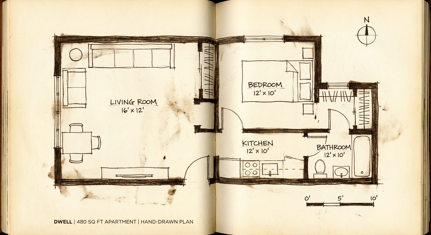
Before you open a single furniture website, you need a complete measurement map of your space. Not just the big numbers like room length and width, but the details that determine whether that sofa you are eyeing will actually work: door swing arcs, outlet positions, window sill heights, and the exact depth of every alcove. Most renters skip this step because it feels tedious. Then they order a bed frame that blocks an outlet, a desk that interferes with the door, or a bookshelf that covers the only window with afternoon light. Thirty minutes of measuring saves hundreds of dollars in returns and months of living with furniture in the wrong place.
Pre-Decorating Measurement Checklist
Tap each item as you measure. Screenshot when done.
What Order Should You Tackle the Rooms?
If you are decorating an entire apartment, the order you tackle rooms matters more than most people realize. The first room you finish sets the design vocabulary for every room that follows. If you start with the bathroom, you will pick tiles and a color palette that then has to carry into your bedroom and living room, which is backwards. The room with the most daily visual impact should come first because it establishes the tone. For most apartments, that is the living room. For studios, that is the sleep zone, because everything else arranges itself around where the bed goes. The tool below will give you a personalized sequence based on your situation, apartment size, and budget.
Room Sequencing Planner
Answer 3 questions and get your personalized decorating order.
What's your situation?
How to Determine the Right Furniture Scale for Your Square Footage
The two-thirds rule is the most reliable starting point for small spaces: no single piece of furniture should occupy more than two-thirds of the wall it sits against. This keeps visual breathing room on both sides and prevents the "furniture store showroom" effect where everything is crammed wall to wall. Scale matters exponentially more in small rooms because every extra inch of sofa depth steals from the walkway, and walkways under 18 inches feel claustrophobic. Use the calculator below to get exact size limits for your specific room.
Furniture Scale Calculator
Enter your room dimensions and get exact furniture size limits.
How to Handle an Awkward Layout: Odd Angles, Bad Windows, Weird Corners
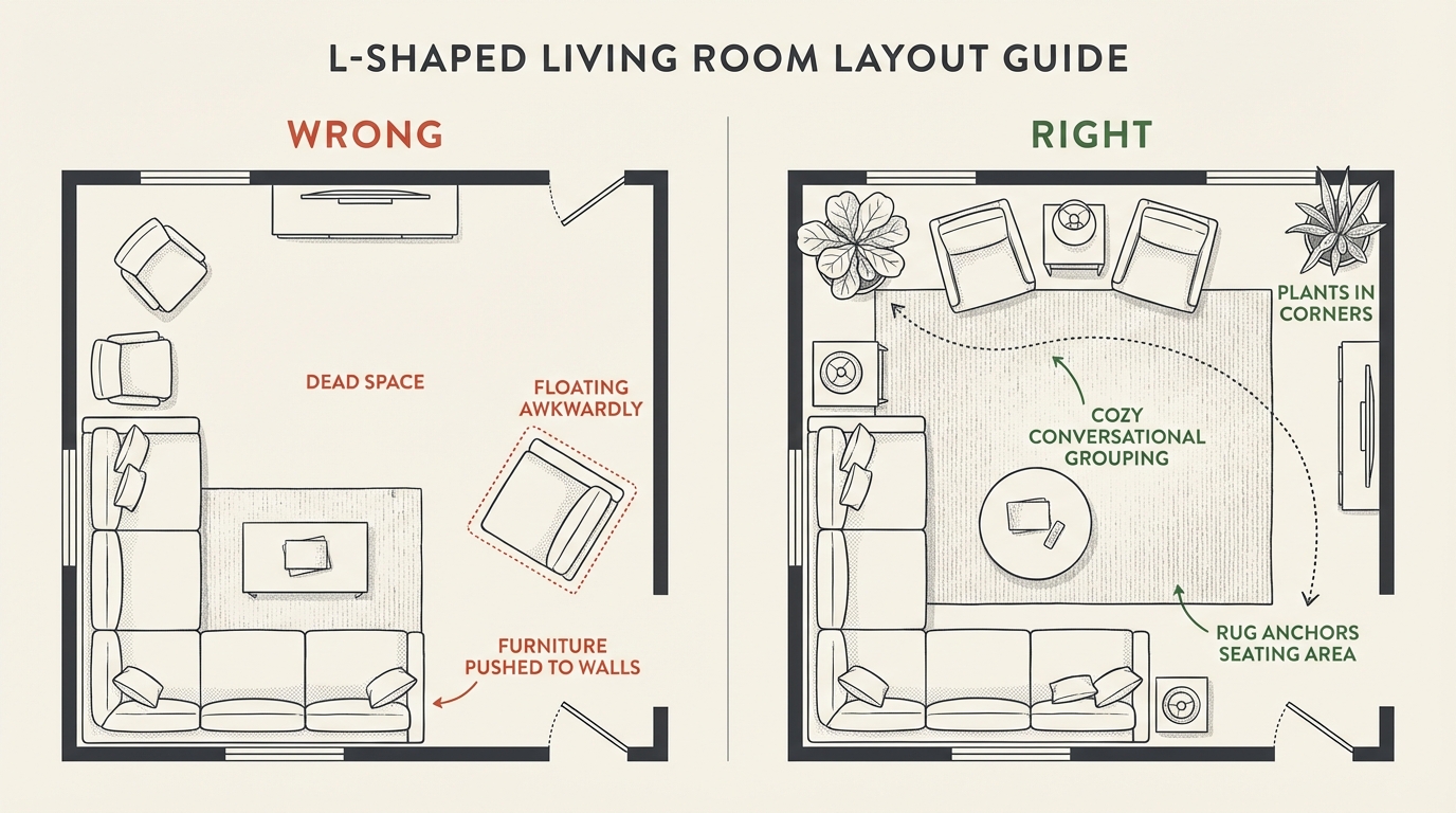
The L-shaped room is probably the most common awkward layout in small apartments, and most people try to fight it by pretending the bend does not exist. That never works. Instead, treat each leg of the L as a separate zone. The longer leg becomes your primary living space with the sofa and rug. The shorter leg becomes a dedicated reading nook, workspace, or dining area. Use a rug or a change in lighting to signal the transition between zones. The moment you stop trying to make it one big rectangle, the L-shape actually gives you more functional space than a simple box would.
Rooms with one badly positioned window are another common frustration. If the window is off-center, do not try to center your furniture layout on the window. Instead, center on the wall and let the window be asymmetric. Hang curtains wider than the window frame to create the illusion of a larger, more centered opening. If the window is in a corner, lean into it: place your desk or reading chair there to capture the natural light and let the rest of the room orient to a different focal point, like a gallery wall on the opposite side.
Weird corners and alcoves are actually gifts in disguise. A 24-inch-deep alcove is a built-in desk waiting to happen. A corner that seems too narrow for furniture is the perfect spot for a floor-to-ceiling tension shelf. The key is measuring these spaces precisely (see the checklist above) and then searching for furniture that fits the exact dimensions rather than trying to repurpose standard-sized pieces. Awkward layouts are the exact use case where seeing the result before committing is most valuable, and that is where tools like Framehouse come in: upload a photo of your awkward room and see how a new layout would actually look.
How to Test Your Layout Before Buying Anything
The cheapest way to test a layout is painter's tape on the floor. Mark the footprint of every piece of furniture you are considering and live with it for 48 hours. Walk through the paths. Sit where the sofa would go. Open every door and drawer. If anything feels tight at the tape stage, it will feel worse with actual furniture. This method is free, takes 20 minutes, and saves more money than any other single piece of advice in this guide.
Floor plan apps are the next step up. Tools like RoomSketcher and MagicPlan let you draw your room to scale and drop in furniture. They are useful for testing multiple arrangements quickly, but they have a limitation: they show you a flat overhead view, not what the room will actually feel like when you are standing in it. That gap between the floor plan and the lived experience is where most decorating mistakes happen. You can have a perfect plan on paper that feels cramped in real life because the proportions do not translate.
AI room design tools solve this by generating a photorealistic image of your redesigned room from your actual photo. You upload a picture of the room as it is now, describe what you want to change, and get back a visualization of the finished result. This is not a floor plan. It is what the room will actually look like. Framehouse was built specifically for this: helping renters see the result before they commit to buying anything. It works especially well for small apartments because scale and proportion errors are immediately visible in a photo-based rendering in a way they are not in a top-down floor plan.
Not Sure What Style You Want? You're Not Alone.
In Framehouse's research, 27% of respondents said "figuring out my style" was their biggest frustration, ahead of both budget and visualization. Most guides skip this step entirely. Framehouse built the Aura Quiz specifically to solve it: a guided experience that helps you identify your design direction in about three minutes, so every decision after that has a foundation.
Ready to see what your room could look like?
Start fixing a room →Living Room Ideas for Small Apartments
The living room is the room that sets the design direction for everything else in your apartment. It is also the room where small apartment mistakes are most visible because it serves the most functions: socializing, relaxing, sometimes eating, sometimes working. The goal is not to make it look bigger than it is. The goal is to make it feel intentional, so that every piece of furniture is there for a reason and the room works the way you actually live.
It is also the room most people want to fix first. In our survey of over 100 respondents, 31% named the living room as their top redesign priority, and that number jumped to 46% among people who completed our Design Aura Quiz.
Furniture Arrangement Strategies That Actually Work
The instinct in a small living room is to push every piece of furniture against the wall to maximize floor space in the center. This is almost always wrong. Floating your sofa even six inches off the wall creates depth and makes the room feel more intentional. It also opens up space behind the sofa for a narrow console table, which gives you a surface for a lamp without needing an end table that takes up floor space.
Traffic flow is the most overlooked element in small living room layout. You need a clear path from every entry point to every seating position, and those paths need to be at least 18 inches wide. If you find yourself turning sideways to get to the sofa, the layout is wrong. Map the paths first, then arrange furniture around them. In rooms under 150 square feet, this often means choosing between a coffee table and a clear path, and the clear path wins every time. Use a small side table instead.
The 18-Inch Rule
Every major traffic path in your room needs at least 18 inches of clearance. Measure this between furniture pieces, not from furniture to wall. If a path feels tight at 18 inches, widen it to 24 and shrink or eliminate the piece causing the squeeze.
Multi-Purpose Furniture Worth Buying and What to Skip
✓ Worth Buying
- Storage ottoman: seating, storage, and coffee table in one
- Nesting tables: expand when hosting, tuck away after
- Daybed with trundle: sofa by day, two beds for guests
- Wall-mounted drop-leaf table: dining or desk that folds flat
- Bench with shoe storage: entryway seating plus hidden organization
✗ Skip These
- Futons: uncomfortable for sitting and sleeping, worst of both
- Oversized sectionals: even "small" ones are usually too big
- Bulky entertainment centers: mount the TV, use a slim console
- Traditional dining sets: a drop-leaf table and two chairs beats a four-seater
- Bean bags: they seem space-saving until you realize they cannot be pushed aside
How to Zone a Living Room or Studio Without Walls
Use rugs to define zones
Each functional area gets its own rug. The rug edge is the zone boundary. All furniture in that zone should have at least its front legs on the rug.
Change the lighting per zone
Living zone gets warm ambient light. Work zone gets a directional task lamp. Sleep zone gets dim, warm lighting only. The light shift tells your brain you have moved to a different space.
Use furniture as dividers
The back of a sofa, an open bookshelf, or a console table placed perpendicular to the wall creates a visual boundary without blocking light or sightlines.
Vary the floor height
A raised platform for the bed or a sunken seating area creates the most dramatic zone definition. This is more work, but in a long-term rental it can transform a studio into something that genuinely feels like multiple rooms.
Mirror Placement and Lighting Tricks That Actually Expand Space
Mirrors work best when they reflect something worth seeing. A mirror facing a window doubles the natural light in the room and creates the illusion of a second window. A mirror facing a blank wall just doubles the blankness. Place your largest mirror on the wall opposite or adjacent to your primary light source, and position it so that when you look at it from your main seating position, you see light, a plant, or depth rather than a close-up of the opposite wall's texture. Oversized leaning mirrors (36 inches or wider) are the most impact-per-dollar item in small apartment decorating because they create architectural depth without any installation.
For lighting, the single most impactful change you can make in a small apartment is to stop using the overhead ceiling fixture as your primary light source. Overhead light flattens the room and casts harsh shadows. Instead, build your lighting from three points: a floor lamp in one corner for ambient light, a table lamp on a console or side table for mid-level warmth, and a task lamp at your desk or reading spot. This three-point approach creates depth and visual zones. Use warm bulbs (2700K) everywhere except the work zone, where a 3500K to 4000K bulb keeps you alert without feeling clinical. Plug-in pendant lights and adhesive-mounted puck lights are fully renter-safe and can add accent lighting to shelves, alcoves, or behind the TV.
Gallery Walls and Art: Why One Large Piece Beats Five Small Ones
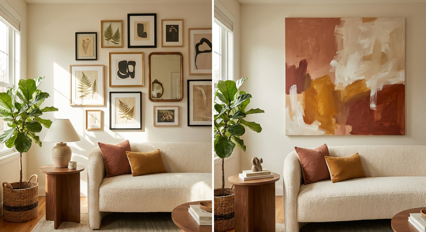
Gallery walls are beautiful in the right context, but in a small apartment they often create visual chaos. When your walls are already close together, a collection of 8 to 12 mismatched frames makes the room feel busy and smaller. One large piece of art (30 by 40 inches or bigger) gives your eye a single place to rest and makes the wall feel intentional. It also creates a focal point that anchors the room and draws attention away from the room's small footprint.
If you do want a gallery wall, constrain it. Pick frames in one color (all black, all natural wood), stick to a grid layout rather than an organic scatter, and limit it to one wall only. The gallery wall should be the accent, not the default. And in small apartments, the best wall for a gallery arrangement is usually the one you see first when entering the room, which creates a strong impression without overwhelming the entire space. Hang art so the center of the arrangement sits at 57 inches from the floor, which is the standard museum hanging height.
Small Apartment Bedroom Ideas
The bedroom in a small apartment serves one essential purpose: rest. Everything in this room should support sleep quality and a sense of calm. That means making hard choices about what belongs here and what does not. If your bedroom is also your office, that tension needs to be managed deliberately. If it is also your closet, the storage solutions need to earn their space. This section covers how to handle the three biggest bedroom challenges in small apartments.
Bed Placement When You Have Limited Options
In most small bedrooms, there is really only one or two viable spots for the bed, and the right choice depends on the door and window positions. The ideal placement puts the headboard on the wall opposite the door so the bed is the first thing you see when you walk in, creating a visual anchor. If that wall has a window, center the bed under the window and use a low headboard or no headboard at all to avoid blocking the light.
When the room is so narrow that a queen bed barely fits, go down to a full. The difference between a full and a queen is only 6 inches of width, but those 6 inches can mean the difference between fitting a nightstand on each side and fitting nothing. If you can only fit one nightstand, use a wall-mounted shelf on the other side. If you cannot fit any nightstand, mount a small shelf at pillow height on each side. This gives you a surface for your phone, a glass of water, and a lamp without any floor footprint. Always leave at least 24 inches of clearance on the side you use to get in and out of bed. If the room cannot accommodate that, the bed is too big for the room.
Storage Under, Over, and Around the Bed
Under-bed storage is the most underused space in a small apartment. A bed frame with built-in drawers eliminates the need for at least one dresser, which frees up 6 to 10 square feet of floor space. If your current frame does not have drawers, bed risers can add 6 to 8 inches of clearance underneath for rolling storage bins. Use vacuum bags for seasonal clothing and flat bins for shoes. Label everything, because the fastest way to lose track of your belongings is to shove unmarked bins under the bed and forget what is in them.
Over-bed storage means the wall above the headboard. A single long floating shelf 8 inches above the headboard gives you display space for books, a small plant, and a framed photo without taking any floor space. If you need more storage, a pair of wall-mounted cubbies flanking the bed can replace nightstands entirely. Around-bed storage includes the vertical corners of the room: a slim tower shelf or a tension rod closet system in an unused corner can hold an entire wardrobe's worth of hanging clothes in 24 inches of floor space. The key is going vertical. Every square foot of wall space from floor to ceiling is usable storage.
Making a Tiny Bedroom Feel Like a Retreat, Not a Closet
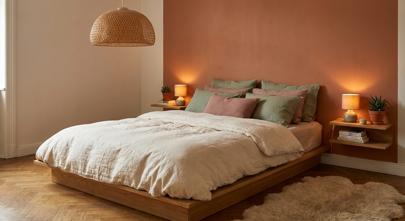
The difference between a tiny bedroom that feels like a retreat and one that feels like a closet comes down to three things: textiles, lighting, and the absence of clutter. Start with the bed. Layer it with a fitted sheet, a flat sheet, a lightweight duvet, and one throw blanket folded at the foot. Add two to three throw pillows maximum. This layering creates visual depth and signals "this is a real bedroom" rather than "this is a mattress in a room." The textures should vary: a linen duvet, a knit throw, a cotton pillowcase. Mixing textures makes even a neutral palette feel rich.
Lighting in a small bedroom should be warm and low. If you have an overhead fixture, put it on a dimmer or simply never use it. Two bedside lamps or wall-mounted sconces with warm bulbs (2700K) are enough. The key is that the light should be at or below eye level when you are in bed, never above. This creates a cave-like, restful atmosphere. Finally, remove everything from the bedroom that does not serve rest. If you work from home and the desk has to be in the bedroom, use a room divider screen or a curtain to visually separate it. When the desk is visible from the bed, your brain never fully disconnects from work.
Studio Apartment vs. 1-Bedroom: Very Different Strategies
People often group studios and one-bedrooms together as "small apartments," but they require completely different decorating strategies. A studio is one room that must serve every function simultaneously. A one-bedroom is a collection of small rooms where style needs to stay cohesive across separate spaces. The techniques overlap, but the priorities and the order of operations are different. Understanding which challenge you are solving is the first step to getting the design right.
Designing a Studio Apartment: Living, Sleeping, and Working in One Room
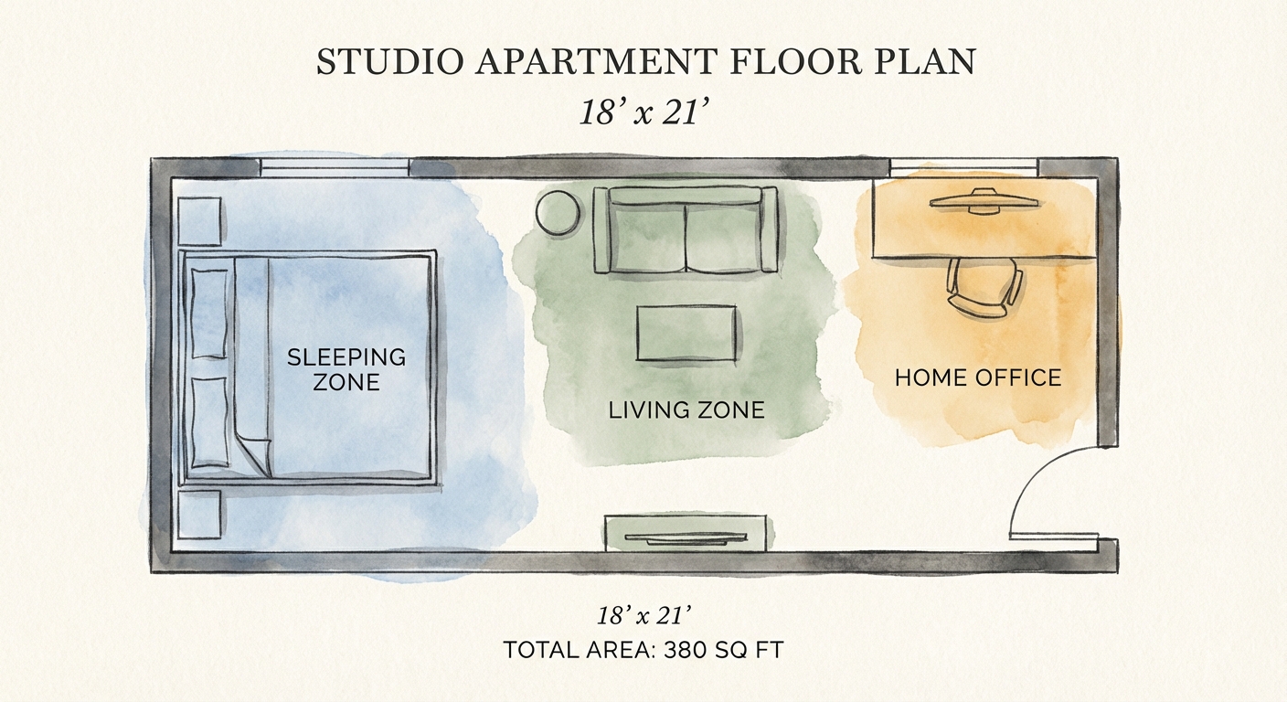
The first decision in a studio is where the bed goes, because everything else arranges around it. In most studios, the bed should go against the wall farthest from the entry door. This puts the living zone between the door and the bed, which means guests see a living room when they walk in, not a bedroom. If your studio has a natural alcove or an L-shaped nook, the bed goes there. The sleeping zone should feel like a separate space even though it is not, and you achieve that separation through lighting (dimmer in the sleep zone), rugs (different rug for each zone), and visual barriers (a bookshelf, curtain, or the back of the sofa).
The work zone in a studio should go wherever the natural light is strongest, which is usually near the window. A wall-mounted drop-leaf desk is ideal because it folds flat when you are not using it, reclaiming that floor space for evening living. If you need a permanent desk, keep it slim (no deeper than 24 inches) and position it so you face the window or the wall, not the bed. Looking at your bed while working is a productivity killer. The living zone fills whatever space remains between the sleep and work zones. Even in a 350 square foot studio, you can fit a loveseat, a small rug, and a floor lamp. That is enough to create a zone that feels intentionally designed rather than leftover.
Using Room Dividers Without Closing Off the Space
The biggest mistake people make with room dividers in studios is choosing something too opaque or too tall. A solid floor-to-ceiling divider blocks light and makes the space feel like two tiny rooms instead of one open one. The best dividers let light through: an open-back bookshelf, a curtain on a ceiling track, or a collection of tall plants on a low credenza. The divider should signal the zone boundary without creating a visual wall.
Ceiling-track curtains are the most versatile option because you can open them fully during the day (making the studio feel its full size) and close them at night (creating a private sleeping area). They install with adhesive ceiling hooks in most apartments, so they are fully renter-safe. Choose a sheer or semi-sheer fabric so that even when closed, some light passes through. The curtain should hang from ceiling to floor for a clean, intentional look. Short curtains on a room divider track look like a hospital partition, and that is not the vibe you want.
1-Bedroom Strategy: Keeping Cross-Room Style Cohesive
The challenge in a one-bedroom is not zoning (the walls do that for you) but cohesion. When each room is small, it is tempting to treat them as independent projects. The kitchen gets one color palette, the bedroom gets another, and the living room goes in a third direction. In a large home this can work. In a small apartment, it makes the space feel chaotic because you can see into multiple rooms at once and the clashing styles collide visually.
The fix is a shared material palette: pick two to three colors, one metal finish (brass, matte black, or chrome, but not all three), and one wood tone that appears in every room. Your living room rug, bedroom throw, and kitchen towels do not need to match, but they should feel like they belong to the same family. If your living room is warm neutrals with brass hardware, your bedroom should continue that warmth rather than pivoting to cool grays and chrome. This continuity makes a 600 square foot apartment feel like a designed space rather than a collection of unrelated rooms.
Decorating for Renters: No-Drill, No-Paint, No-Damage
Renting adds a constraint layer on top of every decorating decision: can I do this without losing my deposit? The good news is that the no-damage toolkit has expanded significantly in the last few years. Adhesive technology, tension-based systems, and removable finishes have reached a point where you can transform a rental apartment without touching a drill or a paintbrush. The bad news is that not every product works as advertised, and some "renter-safe" solutions cause more damage than the traditional methods they replace if used incorrectly.
The Full No-Damage Toolkit: What Is Actually Available in 2026
Adhesive mounting systems
Command strips, adhesive shelf brackets, and velcro-style picture hanging strips. These work on painted drywall and most smooth surfaces. Always check the weight rating and apply to clean, dry surfaces only.
Tension-based systems
Tension rods for curtains, tension shelving poles for floor-to-ceiling storage, and spring-loaded room dividers. These use pressure, not fasteners, and leave no marks when removed.
Peel-and-stick finishes
Removable wallpaper, peel-and-stick backsplash tiles, and removable floor tiles. All are designed to peel off cleanly, but always test one piece in an inconspicuous spot first and remove at room temperature.
Freestanding furniture solutions
Open-back bookshelves as room dividers, leaning mirrors instead of wall-mounted ones, floor lamps instead of hardwired fixtures, and freestanding garment racks instead of closet systems. If it stands on its own, it does not damage anything.
Renter Damage Checker
Can you do this without losing your deposit? Find out.
Hang a gallery wall (nails)
Tap to reveal
Risky. Small nail holes are usually accepted as normal wear but check your lease. Use Command strips rated for the weight instead: they remove cleanly every time.
Mount a curtain rod
Tap to reveal
Deposit risk. Drill holes for a bracket are usually flagged. Use a tension rod inside the window frame for sheer curtains, or an adhesive curtain rod for lighter panels.
Add removable wallpaper
Tap to reveal
Safe. Peel-and-stick wallpaper from Tempaper or Chasing Paper removes cleanly from painted walls. Apply slowly, remove at room temperature. Test one strip first.
Install a ceiling light fixture
Tap to reveal
Not recommended without permission. Touching the ceiling junction box usually requires landlord approval. Use a plug-in pendant instead: same look, no wiring.
Paint a wall
Tap to reveal
Almost always requires permission and repainting on move-out. Use removable wallpaper or large-format peel-and-stick tiles for the accent wall effect without the risk.
Put up floating shelves (drilled)
Tap to reveal
Deposit risk. Drilled shelf anchors leave holes that need patching. Use adhesive shelf brackets rated for your shelf weight, or a floor-to-ceiling tension shelving unit that requires no wall attachment at all.
Add a room divider bookshelf
Tap to reveal
Safe. A freestanding open-back bookshelf used as a room divider requires no wall attachment. Add furniture feet grips to prevent floor scratching.
Swap out a ceiling fan or light fixture
Tap to reveal
Requires landlord permission in most leases. The original fixture must be stored and reinstalled on move-out. If you do it, photograph the original wiring before touching anything.
Use adhesive wall hooks
Tap to reveal
Safe if used correctly. Command hooks remove cleanly when the tab is pulled down slowly at 45 degrees. Never pull the hook forward: that is what causes damage.
Install a tension rod room divider
Tap to reveal
Safe. Tension rods use spring pressure and leave no marks on walls or ceiling. Test the rod's grip on your surface before loading weight on it.
Add peel-and-stick floor tiles
Tap to reveal
Mostly safe. Removable floor tiles lift cleanly from most hard floor surfaces. Do not use on original hardwood: adhesive can damage the finish. Always test one tile first.
Hang a heavy mirror (over 20 lbs)
Tap to reveal
Risky without the right approach. A mirror this heavy needs a proper wall anchor, which means a drill hole. Use a leaning mirror instead, or a French cleat mounted with two large adhesive strips rated for combined weight.
Renter-Friendly Lighting Upgrades That Do Not Touch the Ceiling Fixture
The ceiling fixture in most rentals is either a bare bulb, a boob light (the industry's actual term for that frosted dome fixture), or a fluorescent panel. You cannot remove it, and in most leases you cannot replace it. But you can ignore it. Turn it off and build your lighting from plug-in sources. A plug-in pendant light gives you the look of a hardwired fixture without any electrical work. It hangs from a ceiling hook (adhesive or tension-mounted) and plugs into a wall outlet. Route the cord along the ceiling and down the wall using adhesive cord clips for a clean look.
LED strip lights are the most versatile renter-friendly lighting option available in 2026. Adhesive-backed strips can go behind your TV, under kitchen cabinets, inside bookshelves, or along the underside of a lofted bed to create ambient glow. The best strips are tunable (you can shift from warm to cool white) and dimmable. They cost between $15 and $40 for a full room's worth and peel off cleanly when you move. Combine LED strips with one or two warm floor lamps and a table lamp, and you have a lighting setup that is better than 90% of homes with hardwired fixtures.
How to Make Your Rental Actually Feel Like Home
The difference between a rental that feels temporary and one that feels like home is not money. It is intentionality. A few specific moves make the biggest difference: hang curtains from ceiling height (not from the window frame) because it makes the room feel taller and more finished. Add a large rug that covers at least two-thirds of the main floor area because bare apartment flooring makes every room feel cold. Put real plants in the room because nothing else signals "someone lives here and cares" quite as effectively. And invest in one piece of art or one mirror large enough to be a focal point, because blank walls are the single strongest signal of a temporary space.
Scent is an underrated decorating tool. A candle or a reed diffuser in a scent you associate with comfort makes the apartment feel like yours the moment you walk in. Sound matters too: a small bluetooth speaker playing ambient music when you come home changes the atmosphere more than any piece of furniture. These sensory details cost almost nothing but they transform the experience of living in a space from "I rent here" to "I live here."
💡 Pro tip
If you are struggling to visualize how your rental could feel different, take a photo of the room as it is right now and run it through Framehouse. Seeing the potential in your actual space, with your actual walls and windows, is the fastest way to get motivated and make a plan.
Small Apartment Decorating by Budget
Budget determines strategy, not quality. A well-decorated $300 room beats a poorly planned $3,000 one every time. The key is knowing what to prioritize at each budget level and understanding that some things should never be cheap (your mattress, your rug) while others can always be thrifted or improvised (frames, accessories, small decor). Here is how to approach each tier with specific priorities and spending guidance.
Here is something most guides will not tell you: in our research, 38% of respondents said they were unsure what a redesign should even cost. That uncertainty alone keeps projects from ever starting. The breakdowns below are designed to remove that barrier.
$0–$500
Rearrange, thrift, and DIY. Focus on one statement piece.
$500–$1,500
Strategic investment. Rug, lighting, and one anchor piece.
$1,500+
Quality where it counts. Splurge on the sofa, save on decor.
$0 to $500: Quick Wins and the Power of Rearranging
At this budget, your biggest tool is rearranging what you already own. Before you buy anything, try every possible furniture arrangement in your room. Move the bed to a different wall. Turn the sofa 90 degrees. Pull the desk away from the corner. Most people have never tried more than one or two layouts, and there is usually a dramatically better option hiding in the room you already have. Tape out the new arrangement on the floor first, live with it for 48 hours, then commit.
After rearranging, your best dollar-for-dollar investments at this budget level are, in order: a large rug from a thrift store or an outlet (check RugsUSA and Wayfair clearance for options under $100 in the 5x7 to 6x9 range), two warm-toned light bulbs to replace the harsh cool-white ones in your lamps, one set of curtains hung from ceiling height (IKEA's VIVAN sheer curtains are $15 and look ten times their price when hung properly), and one thrifted or marketplace piece of art large enough to anchor a wall. These four purchases, totaling $150 to $250, will change the room more than any single piece of furniture at three times the price.
$500 to $1,500: The Strategic Investment Framework
This is the sweet spot budget for small apartment decorating. You have enough to buy quality in the pieces that matter most, but not enough to waste on things that do not pull their weight. The framework is simple: spend 30 to 35% on one anchor furniture piece (a good sofa or bed frame), 25 to 30% on a quality rug that fits your room properly, 15 to 20% on lighting (one floor lamp, one table lamp, and better bulbs), and 15% on accessories and decor. Do not split evenly across all categories. The anchor piece and the rug do 80% of the visual work, so they should get 60% of the budget.
At this budget, you can also afford one or two quality storage solutions that make a real difference: an under-bed drawer system ($80 to $150), a wall-mounted coat rack and shelf for the entryway ($40 to $80), or a slim console table behind the sofa ($100 to $200). These pieces pay for themselves in livability because they eliminate clutter, which is the number one enemy of small spaces. Every visible item that does not have a designated home makes the room feel smaller. Storage is not glamorous, but in a small apartment it is the infrastructure that everything else depends on.
Budget Allocator
Enter your total budget and get a recommended spend breakdown.
$800
Rug
$240
A quality rug anchors the whole room. Go as large as your space allows.
Lighting
$160
One floor lamp and one table lamp minimum. Overhead alone is not enough.
Anchor furniture piece
$280
Your sofa or main chair. Buy the best you can afford here.
Accessories and decor
$120
Throw pillows, a plant, one piece of art. Keep it restrained.
$1,500 and Up: Where to Splurge and What to Skip
At this budget, the temptation is to buy everything new. Resist it. Quality on two or three key pieces combined with restraint everywhere else will produce a better result than spreading $3,000 across fifteen mediocre purchases. The pieces worth splurging on are: your sofa (a well-built frame lasts 15 years and gets reupholstered rather than replaced), your mattress (you spend a third of your life on it, so this is a health investment, not a decor decision), and your rug (a quality wool or cotton rug ages beautifully, while a cheap synthetic one looks worse every year).
What to skip at any budget: decorative throw pillow covers over $30 each (Target and H&M Home have excellent options under $15), picture frames over $40 (thrift stores and IKEA are the move), and anything marketed as "small space furniture" that is just regular furniture made cheaper and smaller. A quality loveseat from a real furniture maker is always better than a cheap "apartment-sized sofa" from a fast furniture brand. The word "apartment-sized" in a product description is a marketing signal, not a design credential. Look for real dimensions and real construction instead.
Common Small Apartment Decorating Mistakes
After helping hundreds of renters redesign their spaces, these five mistakes account for the majority of small apartment decorating problems. Each one is fixable, but they are much easier to prevent than to correct after the furniture is already in the room. Read these before you buy anything.
Mistake #1
Furniture that is too large
This is the most common and most expensive mistake. An 88-inch sofa in a room that can only handle 72 inches does not just look too big. It breaks the entire traffic flow, eliminates the possibility of a coffee table, and makes the room feel like a furniture warehouse. Always measure the wall you plan to use, apply the two-thirds rule, and check whether you can still walk comfortably around the piece with 18 inches of clearance on all traffic paths. If the sofa you love is 6 inches too long, it is the wrong sofa. No amount of styling will fix a piece that is the wrong scale for the room.
Mistake #2
Too many small items instead of one statement piece
Small apartments attract clutter because people try to fill the space with many small items rather than committing to a few larger ones. Five tiny plants on a windowsill create visual noise. One large plant on the floor creates a focal point. Eight small frames scattered across a wall look chaotic. One oversized piece of art looks intentional. The rule in small spaces is: fewer items, each with more visual weight. If you walk into your room and your eye does not know where to land, you have too many small things competing for attention.
Mistake #3
Ignoring vertical space
Most small apartment renters decorate from the floor to about five feet up and leave everything above that completely empty. This wastes the most abundant resource in the room: vertical wall space. Floating shelves, tall bookshelves, wall-mounted planters, and curtains hung from ceiling height all draw the eye upward and make the room feel taller. If your ceiling is 8 feet or higher, you have at least three feet of usable wall space that you are probably ignoring right now. A single shelf running the full length of a wall at 7 feet creates a display ledge for books and art that takes zero floor space.
Mistake #4
Heavy curtains and dark walls without compensating light
Dark colors and heavy fabrics can be beautiful in small spaces, but they require more artificial lighting to compensate for the light they absorb. A dark accent wall with two warm lamps flanking it looks dramatic and intentional. A dark accent wall with no additional lighting looks like a cave. If you go dark on walls, add at least one extra light source to that area. The same applies to curtains: blackout curtains are great for sleep, but if you use them in the living room, the room will feel significantly smaller during the day. Use sheer curtains in living spaces and save the blackouts for the bedroom.
Mistake #5
No defined zones
In a studio or an open-plan space, the biggest mistake is treating the entire room as one undifferentiated area. When there are no visual boundaries between where you sleep, where you work, and where you relax, your brain never fully shifts between modes. You are always a little bit at work and never fully at rest. Zones do not require walls. A different rug, a change in lighting, or a piece of furniture placed as a divider is enough to signal "this area is for this purpose." The moment you define zones, the same square footage feels like more space because each zone has its own identity.
What Layout Actually Works for Your Room's Dimensions?
Different room dimensions create different layout possibilities. A 10 by 12 room has entirely different furniture limits than a 12 by 15. This section is a reference resource: find your room size, see what works, and skip the trial-and-error. If your room does not match any of these dimensions exactly, use the two-thirds rule and the furniture calculator above as your universal fallback.
The Most Common Small Apartment Room Dimensions (and What Works in Each)
| Dimensions | Sq Ft | Max Sofa | Rug Size | Best For |
|---|---|---|---|---|
| 9×10 | 90 | 60" | 4×6 | Bedroom only |
| 10×12 | 120 | 72" | 5×7 | Bedroom or small living |
| 11×14 | 154 | 84" | 6×9 | Living room |
| 12×15 | 180 | 84" | 8×10 | Living room with dining |
| 13×18 | 234 | 96" | 8×10 | Open plan studio |
| 15×20 | 300 | 96" | 9×12 | Large studio / loft |
10×12 (120 sq ft): This is the most common small bedroom size in US apartments. A queen bed fits, but only if you sacrifice one nightstand. A full bed is the better choice because it gives you 6 extra inches on each side for narrow nightstands or wall-mounted shelves. The 5×7 rug should go under the bottom two-thirds of the bed with the top third exposed against the headboard wall. If this room is a living room, you can fit a 72-inch sofa, a small coffee table, and a TV console, but only if you skip the armchair. Choose two seats or a coffee table, not both.
11×14 (154 sq ft): This is the sweet spot for small living rooms. You have enough space for a standard sofa (up to 84 inches), a coffee table, and one accent chair. The 6×9 rug anchors the seating area with all front legs on the rug. This room can support a two-zone layout: seating on one end and a small dining table for two on the other end, separated by the back of the sofa. Traffic flow works best with the sofa on the long wall and the TV on the short wall opposite.
12×15 (180 sq ft): This size gives you real flexibility. You can do a full living room layout with a sofa, two chairs, a coffee table, and a 4-seat dining table in the back half of the room. The 8×10 rug defines the living zone, and the dining zone sits on the bare floor or on a smaller rug. This room can also work as a master bedroom with a king bed, two nightstands, and a reading nook in the corner. At this size, the furniture scale calculator above becomes less critical because you are approaching standard-room proportions, but the two-thirds rule on sofa-to-wall ratio still applies.
When Your Room Does Not Match Any Standard Dimension
Most real apartments have rooms that do not match any standard template. Walls are not perfectly straight, corners are not perfectly square, and there is always one weird feature (a column, a radiator, a bump-out) that ruins the textbook layout. When this happens, fall back on two universal rules. First, the two-thirds rule: no furniture piece should exceed two-thirds of the wall it sits against, regardless of the room's total dimensions. Second, the 18-inch clearance rule: every primary walkway needs at least 18 inches of clear space, measured between the edges of the furniture, not from furniture to wall.
These two rules work in any room shape because they are based on human proportions (how wide your body is when walking, how much visual breathing room feels comfortable), not on room geometry. If your room is a weird trapezoid with one angled wall, the two-thirds rule still tells you the maximum sofa width, and the 18-inch rule still tells you whether the traffic path works. And if you want to skip the mental math entirely, Framehouse works from a photo of your actual space, not a template. It sees the radiator, the column, and the weird corner, and designs around them.
Using AI to Design Your Small Apartment
AI room design is not a gimmick anymore. In 2026, the technology has matured to the point where you can upload a photo of your actual room, describe the changes you want, and get back a photorealistic rendering of the redesigned space in under a minute. For small apartment decorating specifically, this matters because the margin for error is so thin. A sofa that is six inches too deep, a rug that is one size too small, or a color palette that makes the room feel darker than expected: these are all mistakes that AI visualization can catch before you spend any money.
This is not just our opinion. In Framehouse's Confidence Gap research, 85% of respondents said photorealistic redesigns of their actual room, personalized to their style, would be valuable or extremely valuable. The demand for seeing your own space transformed, not someone else's, is overwhelming.
Why Small Apartment Decorating Requires More Planning Than Large Rooms
In a large room, you can absorb mistakes. An oversized coffee table in a 300 square foot living room is barely noticeable. The same coffee table in a 120 square foot room blocks the entire traffic path. Small rooms have no buffer zone: every piece of furniture interacts with every other piece, and one wrong decision cascades through the entire layout. This is why planning matters exponentially more as the room gets smaller. You need to see the finished result before you commit, because undoing a bad purchase in a small apartment is not just returning the furniture; it is starting the entire layout over.
The traditional planning process (measure, sketch, imagine, buy, hope) has a critical weakness: the "imagine" step. Most people cannot accurately visualize how a room will look with new furniture in it. They underestimate how much space a sofa takes up, overestimate how much light a dark wall absorbs, and misjudge how patterns interact at room scale versus how they look in an online product photo. This imagination gap is where most decorating money gets wasted, and it is the gap that AI room design tools are designed to close.
Our research confirms this: 43% of people say the inability to visualize changes in their actual room is their number one problem with current design tools. That is not a preference. It is the top barrier standing between intention and action.
How AI Room Design Tools Work and What They Are Actually Good At
AI room design tools use generative image models trained on millions of interior design photos. You provide an input (usually a photo of your room) and a text description of what you want changed (new furniture style, different color palette, specific pieces). The AI generates a new image that shows your room with those changes applied, maintaining the correct perspective, lighting conditions, and spatial proportions of the original photo. The best tools produce results that are photorealistic enough to serve as a reliable preview of the finished room.
Upload a photo of your room
Take a clear photo from the corner of the room, capturing as much of the space as possible. Natural daylight produces the best results.
Describe your style or changes
Be specific: 'mid-century modern with a walnut credenza and warm neutral palette' works better than 'make it look nice.' Include constraints like 'keep the existing sofa.'
Review the AI redesign
The tool generates a photorealistic rendering of your room with the requested changes. Check proportions, traffic paths, and the overall feel.
Iterate and refine
Adjust your description and regenerate until the result matches your vision. Try different styles, color palettes, or furniture arrangements to compare options.
What Framehouse Does That a Pinterest Board Cannot
Pinterest is a discovery tool. It shows you beautiful rooms that belong to other people in other apartments with other dimensions and other budgets. It is excellent for building a mood board and identifying the styles you gravitate toward. But it cannot answer the question that actually matters: "Will this look good in my specific room?" That is the question Framehouse answers. It takes your actual room photo and shows you how a specific style, layout, or color palette would look in your space, with your walls, your windows, and your lighting.
The second thing Framehouse does that a Pinterest board cannot is account for scale. When you save a photo of a beautiful living room on Pinterest, you have no idea whether that room is 150 square feet or 400 square feet. The sofa looks perfect in the photo, but it might be a 96-inch sectional that would swallow your room whole. Framehouse generates the redesign from your actual room dimensions (derived from the photo), so every piece of furniture in the visualization is proportionally correct for your space. If a sofa would be too big, you will see it immediately. That one insight alone can save hundreds of dollars in avoided buying mistakes.
Ready to see what your room could look like?
Start fixing a room →A Step-by-Step Walkthrough: Using Framehouse to Plan a Studio Apartment
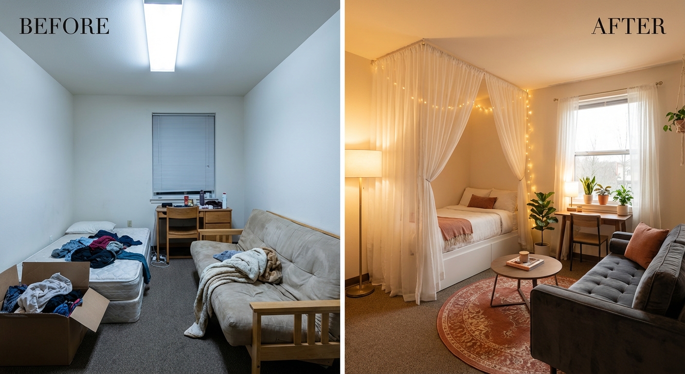
Here is a real scenario. A 380 square foot studio in Chicago, one window facing east, a radiator under the window, a galley kitchen along the left wall, and a bathroom door that swings into the main living area. The renter has a queen bed, a desk, and a two-seat sofa, and the room feels cramped and zoneless. They uploaded a photo to Framehouse and described what they wanted: "Scandinavian minimalist, defined sleep and living zones, warm lighting, the bed should feel separate from the rest of the room."
Framehouse generated a redesign that moved the bed to the far wall with a ceiling-track curtain as a soft divider, positioned the desk under the window to capture the morning light, and placed the sofa perpendicular to the bed zone with its back serving as the zone boundary. The visualization showed that a 5×7 rug in the living zone and a smaller 3×5 rug under the desk would define the areas without overlapping. It also suggested a wall-mounted shelf above the sofa as a replacement for the end table, freeing up floor space in the traffic path.
The total cost to execute the redesign: $420. That included a tension-mounted curtain track ($35), two rugs from RugsUSA ($85 and $45), three warm LED bulbs ($18), a wall-mounted shelf with adhesive brackets ($55), two plants ($40), and a linen curtain panel ($42). The sofa, bed, and desk were all pieces the renter already owned. The Framehouse visualization gave them the confidence to rearrange without buying a new sofa, which was their original plan. That saved over $600.
Room-by-Room Quick Reference
Five specific, actionable tips for each room in your apartment. Bookmark this section and come back to it when you are ready to tackle each space.
Kitchen
- 1.Add an adhesive-mounted magnetic knife strip to free up counter space
- 2.Use a tension rod under the sink for hanging spray bottles
- 3.Replace overhead bulbs with warm 2700K LEDs for a less clinical feel
- 4.Add one open shelf above the counter for your three most-used items
- 5.Use a rolling cart as a portable island that tucks away when not in use
Bathroom
- 1.Over-the-toilet shelving is the single highest-ROI bathroom storage move
- 2.A shower caddy with tension rod mounting holds everything without suction cups falling
- 3.Replace the showerhead (keep the original for move-out) for an instant upgrade
- 4.Add a small plant that thrives in humidity: pothos, fern, or bamboo
- 5.Use a tray on the counter to corral toiletries, which makes even a cluttered bathroom look intentional
Entryway
- 1.A wall-mounted coat hook rack with a shelf on top handles coats and keys in 24 inches of wall
- 2.A narrow console table or floating shelf gives you a landing pad for mail and sunglasses
- 3.A small rug or mat signals the transition into the home and protects the floor
- 4.One mirror at the entry makes the space feel larger and gives you a last check before leaving
- 5.Add a shoe tray or slim shoe rack to prevent the pile-up that makes entryways feel chaotic
Balcony
- 1.Outdoor string lights transform a basic balcony into an evening hangout for under $20
- 2.A folding bistro table and two chairs provide dining space that stores flat against the wall
- 3.Use vertical planter systems to grow herbs or flowers without taking floor space
- 4.An outdoor rug makes a concrete balcony feel like a room rather than a ledge
- 5.A privacy screen or tall planter creates a sense of enclosure without blocking light
The One Insight That Changes Everything
The single most important thing you can do before decorating a small apartment is plan the layout before you buy anything. Measure the room, define the zones, calculate the furniture scale limits, and visualize the finished result. Every dollar you spend after that point is informed by a clear picture of what the room should look like. Every dollar you spend without that picture is a gamble.
Framehouse exists to close that gap between the plan and the result. Upload a photo, see the redesign, and start buying with confidence. No more guessing whether the sofa fits. No more returning the rug that looked right online but wrong in person. No more living with a layout that is "fine" when it could be great.
Start fixing a room →