Somewhere in your home there is a wall that has been three colors in eighteen months. Greige, then a green that read distinctly minty under lamplight, then back to greige, because at least greige never actively betrayed anyone. You did not lack taste. You lacked an order of operations.
A room color palette is not a lucky guess made under fluorescent lights in aisle seven. It is a short sequence of decisions, made in the right order, and once you make them in that order the repainting stops. Here is the sequence, plus the reason your last white turned faintly pink.
1. Start With What You Refuse to Replace
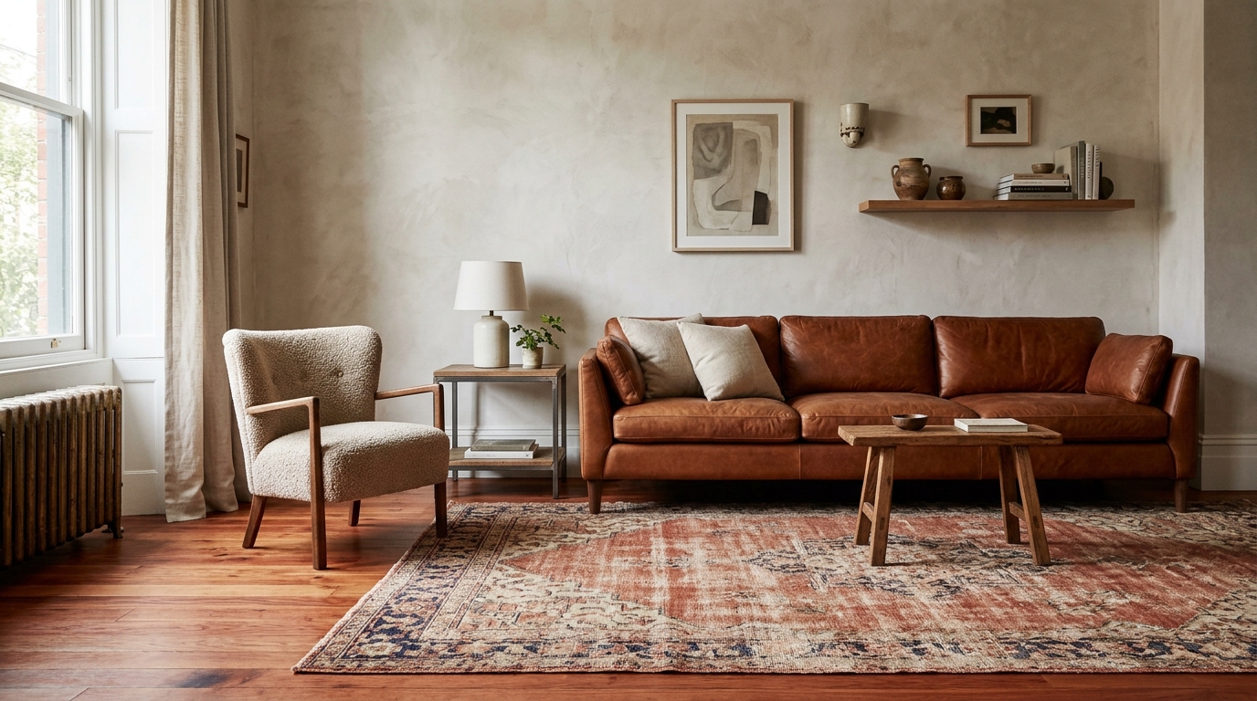
Before you look at a single chip, take inventory of everything staying put: the floors, the sofa you finally paid off, the rug, the countertop, the fireplace tile that came with the house and is not going anywhere. Those items have already cast their votes. Your palette does not get to overrule them.
Flooring is usually the loudest voice in the room, because it is the largest continuous surface after the walls. Red-toned oak, cool grey plank, and creamy travertine each demand a different neighbor. Pick the wall color to flatter what is already underfoot, and half the work is done before you open a can.
2. The 60-30-10 Rule, Design's Most Useful Arithmetic
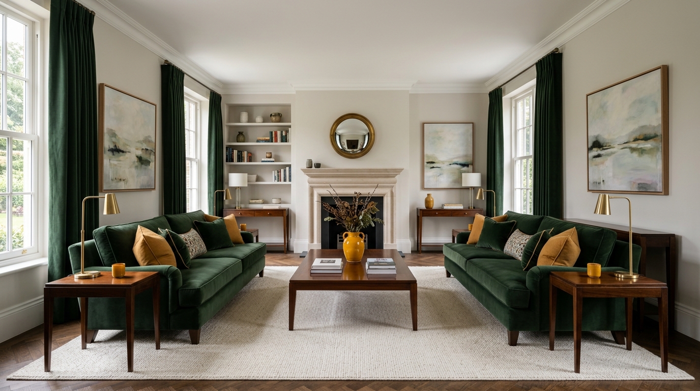
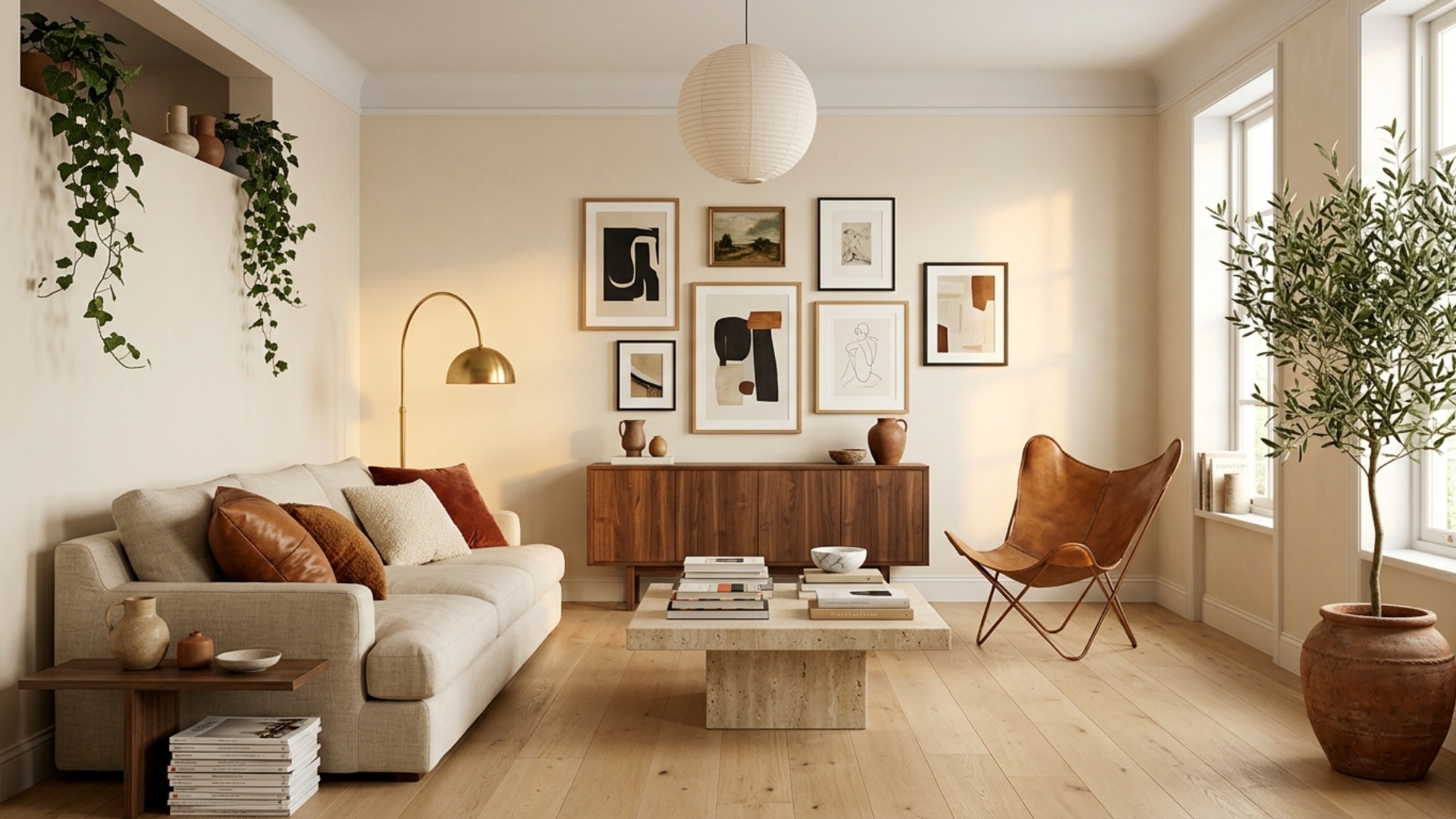
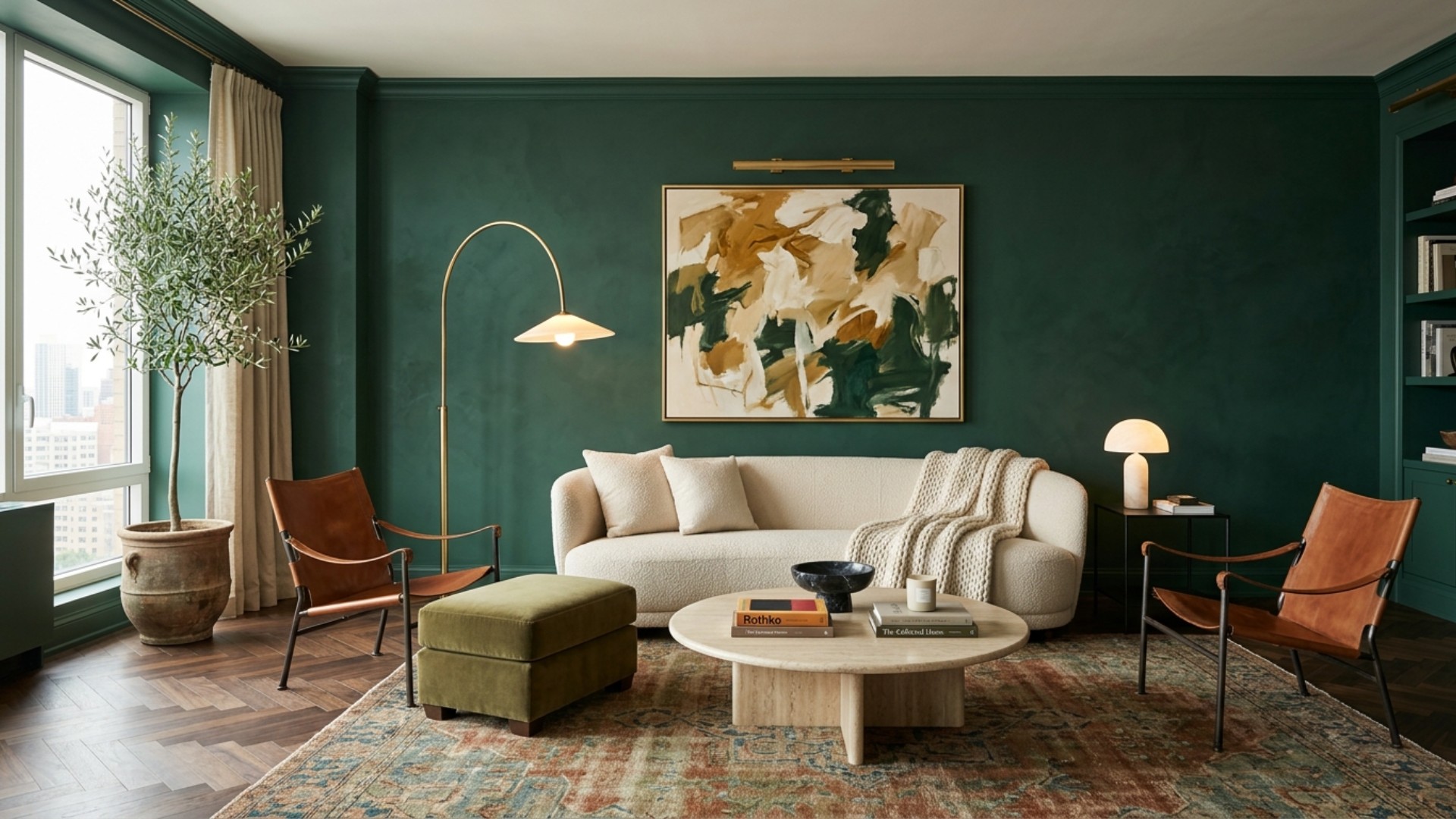
The rule is simple: 60 percent of the room goes to a dominant color, 30 percent to a secondary, and 10 percent to an accent. The dominant is your walls and largest soft surfaces. The secondary shows up in cabinetry, curtains, a second seating piece, or a big upholstered headboard. The accent is the fun part: pillows, art, a lamp base, the hardware.
Three colors. Not seven. The ratio is what keeps a room from either shouting or disappearing, and it is the reason a professionally designed space feels resolved while a well-intentioned one feels busy. Treat it as a starting ratio rather than a statute. Plenty of designers break it on purpose, but they break it knowingly, which is the difference.
3. Undertones, or Why Your White Went Pink
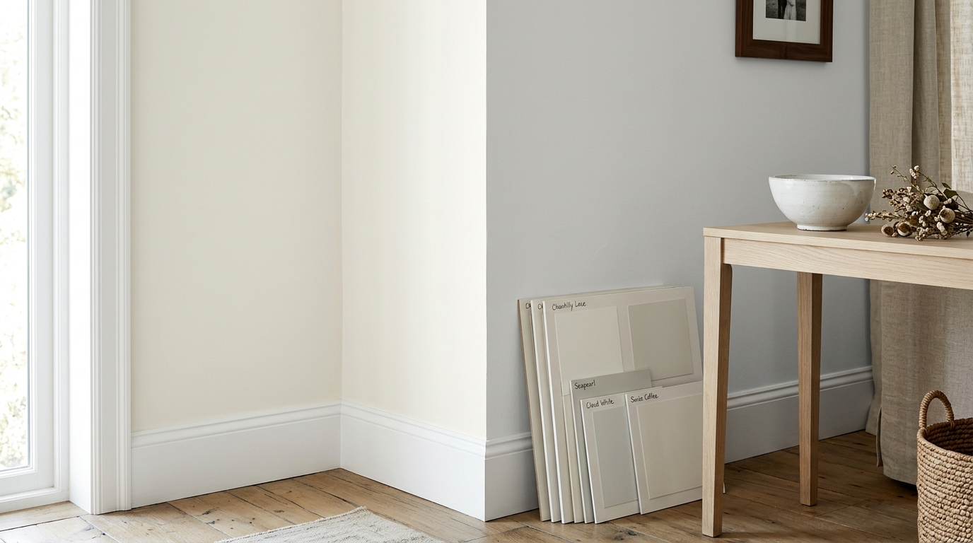
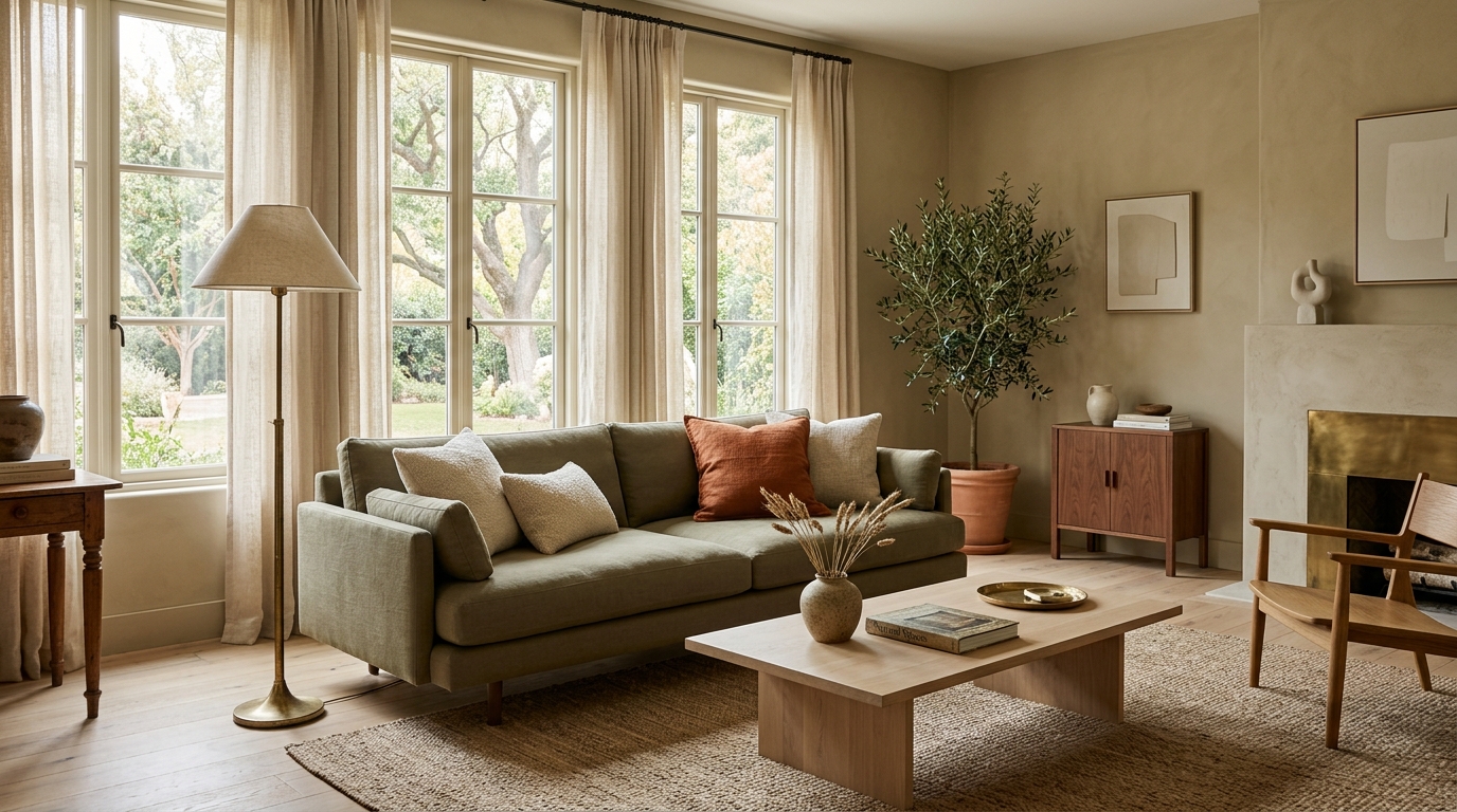
Every neutral is secretly a color wearing a very good coat. Whites lean warm yellow, cool blue, green, or pink. Greys slide toward blue, violet, or green, which is how a "safe" grey ends up looking like a hospital corridor next to a warm oak floor. Beiges can carry pink, gold, or green.
The trick professionals use costs nothing: hold the chip against a sheet of pure white printer paper. Isolated from everything else, the undertone reveals itself immediately. Then hold it against your floor, your counter, your sofa. Colors are only ever seen in company, and a chip that behaves alone can misbehave badly in a crowd.
4. Light Is the Fourth Color in Every Room
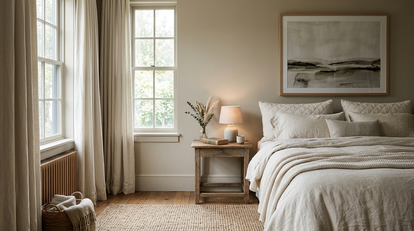
North-facing rooms receive the least light, and what arrives is cool and low in intensity, behaving like a soft grey filter over everything. Cool undertones get amplified, warm ones get muted, and the whole color drops a shade compared with the chip in the store. Sherwin-Williams advises countering that by choosing warm undertones rather than cool ones in north-facing spaces. South-facing rooms, flush with warm generous light, can carry cooler and deeper shades without going gloomy.
This is also where LRV earns its keep. Light Reflectance Value runs from 0 (absorbs everything) to 100 (reflects everything), and it tells you how light a color will actually behave. For a dim north-facing room, a warm color in roughly the 58 to 85 LRV band stays bright without going cold. Finish nudges the perception too: gloss and satin read a touch brighter than a flat or matte version of the identical color, typically by a few perceived points.
5. A Palette for Every Room, Bathroom Included
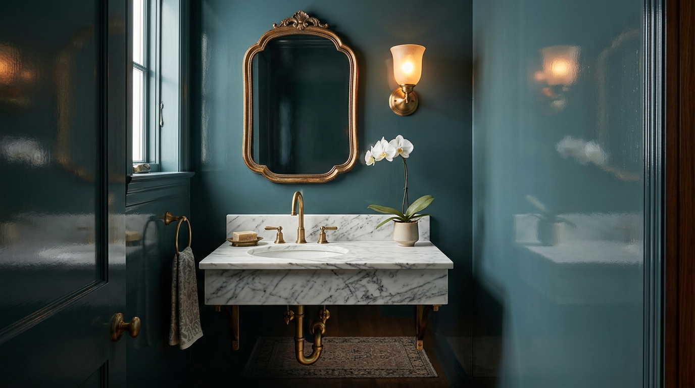
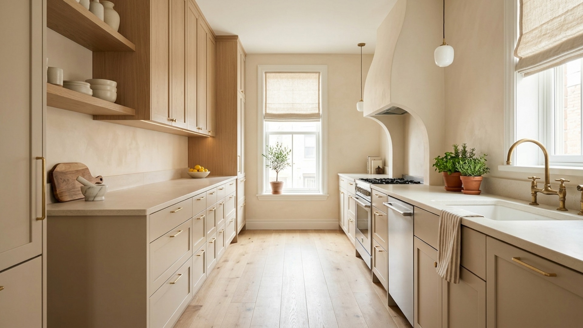
Different rooms want different jobs from color. Living rooms reward a warm neutral dominant with a deeper secondary, so the space reads layered rather than beige. Bedrooms do their best work lower on the LRV scale, where restorative greens and grounded browns quiet things down. Kitchens want the palette anchored to the counter and the cabinet finish. Small rooms with short visits, powder rooms and entries especially, are precisely where you should be brave, because a saturated color you would not live with all day is a delight for ninety seconds.
The 2026 forecasts agree on the direction. Sherwin-Williams named Universal Khaki, a warm earthy neutral, under a theme it calls Tailored and Timeless. Benjamin Moore chose Silhouette AF-655, a rich espresso with notes of charcoal. Behr went with Hidden Gem, a smoky jade blue-green. Different shades, one message: the cool grey decade is over, and warmth, depth, and nature-borrowed color have taken the room.
6. The Four Mistakes That Cause Most Repainting
Choosing the wall color first. Walls are the easiest thing in the room to change and the hardest thing to choose in a vacuum. Pick your fabrics, your rug, and your finishes first, then let the paint follow. Fabric ranges are finite. Paint decks are effectively infinite, which makes paint the far more flexible partner.
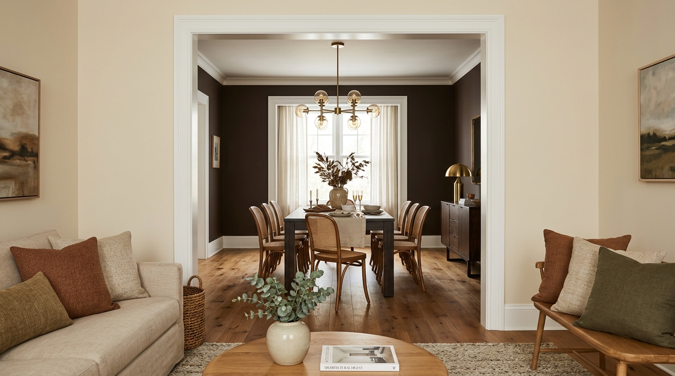
Ignoring what the next room is doing. Rooms are seen through doorways, not in isolation. Sightlines matter, so walk the path a guest walks and make sure the palette carries from space to space. A shared undertone across a whole floor, warm throughout or cool throughout, is what makes a home feel considered rather than assembled room by room.
Buying the sample and the gallons on the same trip. Live with the sample for at least two full days. Colors change with the weather, and so do opinions.
Testing under the wrong bulbs. A warm 2700K bulb and a cool 4000K bulb can make the same wall look like two different colors. Whatever lighting you actually live with is the lighting your test needs to survive.
7. Test It Before You Tape It
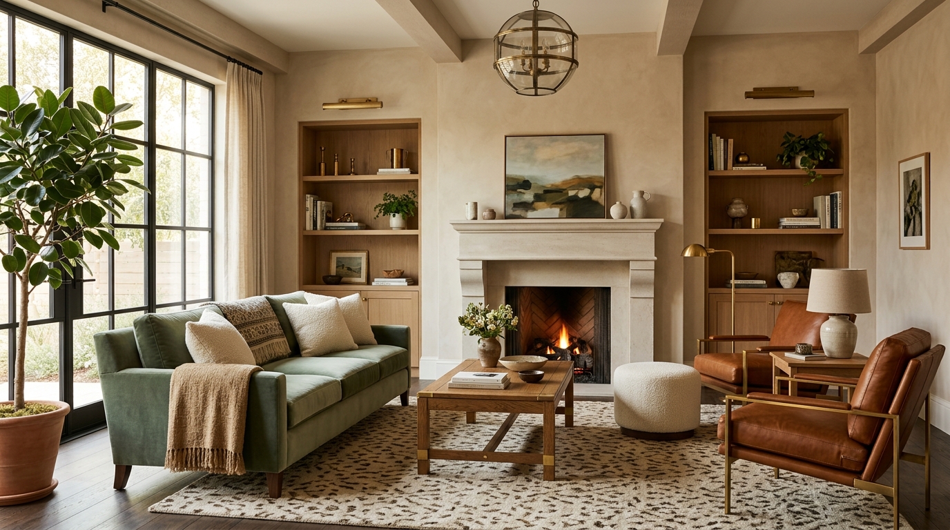
Never judge a color from a chip the size of a business card. Paint a large sample, at least a couple of feet square, and put it on more than one wall, because every wall in a room gets different light. Better still, paint the sample on poster board so you can move it around, prop it near the sofa, and stand it up at night under the lamps you actually use. Look at it in the morning, at noon, and after dark. A color that only works at 2pm is not a color, it is a coincidence.
Or skip the drop cloth entirely. Upload a photo of the room to Framehouse, and see your own walls, your own light, and your own furniture in a full palette before you buy a single quart. You do not get a prettier stock photo, you get the plan: the complete design playbook with everything you need to make it real. Start free, and let the greige era end on a good note.