Mid Century Modern Studio Apartment Ideas That Maximize Space
Mid century modern is the rare style that was designed for small rooms in the first place, which is why it works so well in a studio. Here is how to use it to get a one room apartment to read as three separate zones.
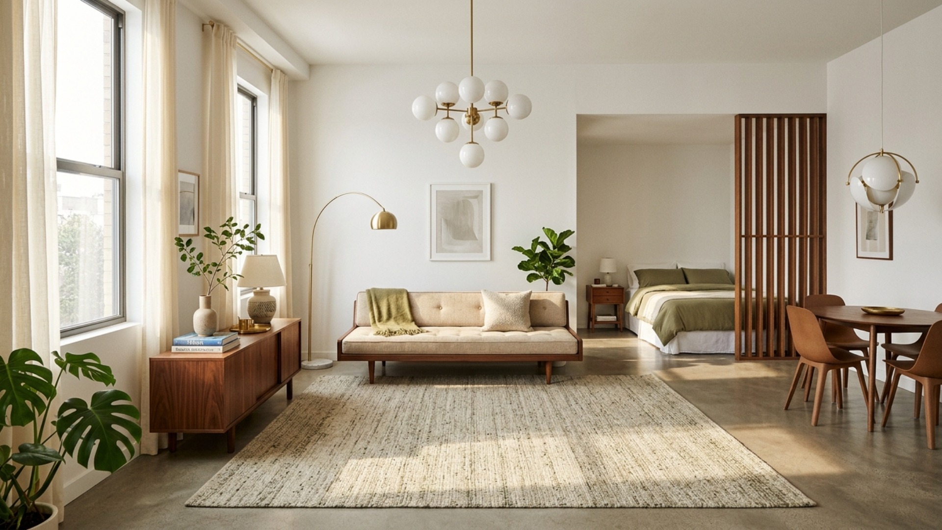
The real problem
Why this is harder than it looks
Mid century modern gets treated as a look you apply to a room: buy a walnut credenza, add tapered legs, hang a starburst clock. In a studio that approach fails quickly, because the pieces arrive and the apartment still feels like one cluttered box with nice furniture in it. The style is not decoration here. It is a set of solutions to exactly this problem.
What is actually going on is that mid century furniture was designed during a postwar housing boom for small apartments and small houses. That is why the sofas sit low and lean, why the legs are exposed and tapered, why storage is horizontal and wall hung. Every one of those choices makes a room read larger: you see more floor, more wall, and more uninterrupted sightline. Borrow the logic and the look comes with it.
In a studio the specific starting point is that one room has to do four jobs, and the jobs conflict. You sleep, work, eat, and receive guests in the same three hundred to five hundred square feet, and none of those activities wants to look at the others. There is no door to close, so the zoning has to be done with furniture, rugs, and sightlines.
The failure pattern is pushing everything against the walls. It feels like it creates space and it does the opposite: you end up with a dead pool of floor in the middle and no defined areas at all, so the room reads as one undifferentiated box. Floating a sofa eighteen inches off the wall to make a living zone costs nothing and is the single biggest improvement most studios can make.
A clear path
How to plan it
-
01
Zone the room before you buy a single piece
Decide on paper where sleeping, living, and working go, and put the bed furthest from the door so it is not the first thing anyone sees. Give each zone a boundary you can point at: a rug edge, the back of the sofa, the side of a credenza. Three defined zones in five hundred square feet feel larger than one open five hundred square feet.
-
02
Float the sofa and let it do the dividing
Pull the sofa off the wall and turn its back toward the sleeping area. A low walnut frame sofa with exposed legs, something in the range of the Article Sven or a vintage style three seater, divides the room without blocking light or sightline, which is exactly what a folding screen or a bookcase fails to do.
-
03
Buy legs, not skirts
Every large piece should show its legs. Visible floor under a sofa, bed, and credenza reads as continuous space, and it is the reason mid century furniture makes a small room look bigger than a skirted or box framed equivalent. It also makes the room far easier to clean, which matters more in a studio than anywhere else.
-
04
Go horizontal and low with storage
A long low walnut credenza does more work than a tall bookcase: it stores as much, it doubles as a media unit and a sideboard, and it keeps the wall above free so the room breathes. Keep everything below thirty six inches except one tall plant, and the ceiling will feel higher than it is.
-
05
Visualize the layout before you commit the budget
Furniture scale is the thing people get wrong in a studio, and it is nearly impossible to judge from a product page where every sofa looks the right size. Put your actual room dimensions into Framehouse, try the floating sofa position and the credenza wall, and see the walnut against your floor before anything is ordered. A sofa that is eight inches too deep is an expensive mistake to discover on delivery day.
Built for studio maximization
Moves that pay off
A studio is a scale and circulation problem. The furniture has to be smaller than you want it to be, and the paths between zones have to stay clear, or the room fights you every day.
- Measure your walking paths first and keep thirty inches clear between zones. Circulation is what makes a small room feel generous.
- Buy the sofa by depth, not by looks. Anything over thirty six inches deep will eat a studio. Mid century frames are typically shallower, which is part of why they suit the space.
- Get a bed with storage underneath or raise it on risers and hide bins behind a valance. This is the largest untapped storage in most studios.
- Use one round dining or work table rather than a rectangle. Round tables have no corners to walk around and can seat an extra person when needed.
- Skip the accent chair for now. It is the piece most likely to become a place to pile clothing.
- Defer the rug until the layout is settled, then buy it large enough that the front legs of the sofa sit on it. A too small rug is the most common studio mistake and it shrinks the room.
mid century modern cues
What to keep, what to skip
Mid century modern lives on warm wood, clean lines, and restraint. The failure mode is the theme room, so use the vocabulary and stop before it turns into a period reproduction.
- Palette: warm white or soft oatmeal walls, walnut or teak wood, and one or two saturated accents in mustard, olive, or burnt orange.
- Materials: walnut, cane, wool, brushed brass, and a little smoked glass. Keep chrome to a minimum unless the piece is genuinely a classic.
- Furniture signature: tapered legs and a lifted profile on everything large. This is the detail that makes the style work in a small space.
- Lighting: a globe or dome pendant plus an arc floor lamp. Two well chosen fixtures beat six small lamps in a studio.
- One vintage or vintage style piece, ideally the credenza, keeps the room from looking like a catalog page.
- Skip: starburst clocks, kidney shaped coffee tables, and full sets of matching furniture. One or two strong pieces read as taste, and a whole room of them reads as a set.
Use it for
What people plan with Framehouse
- Test a floating sofa layout before you rearrange anything
- Check whether a walnut credenza fits the wall you had in mind
- See how a low profile bed changes the sense of ceiling height
- Compare two zoning layouts side by side before committing
- Show a partner how the studio will work as three separate areas
Quick answers
Common questions
Make a plan you can act on
Skip the spiral of mood boards. Three minutes in the Aura Quiz turns your taste into a direction.
Take the Aura Quiz