Coastal Studio Apartment Ideas for Maximizing Space
A studio does not need more storage nearly as often as it needs fewer visual edges. Coastal is unusually good at that, because it works by removing contrast rather than by adding clever furniture.
The real problem
Why this is harder than it looks
Everyone approaches a studio as a storage problem, and it usually is not. It is a boundary problem. One room has to be a bedroom, a living room, an office, and a dining room, and the reason it feels cramped is that all four are happening in the same visual field with nothing telling your eye where one stops. Adding another storage unit puts one more edge into that field, which is why the room often feels smaller after a tidy up than before.
What actually creates space in a studio is fewer interruptions. Every colour change, every different wood tone, every tall vertical object is a place where the eye stops, and a room reads as large in proportion to how far the eye can travel without stopping. This is precisely what coastal does for a living. A narrow tonal band from wall to floor to furniture means the boundaries between surfaces soften, and a small room reads as one continuous volume rather than a collection of separate objects crammed together.
The starting point is usually a rectangle between 30 and 50 square metres with windows on one wall, a kitchenette at one end, and a bathroom door in the wrong place. The furniture arrived from a one bedroom flat and is a size too big for everything. There is a tall bookcase somewhere doing enormous damage.
The failure pattern is buying convertible furniture as a first response. A sofa bed, a wall bed, a nest of tables, and an ottoman that opens, none of which address the boundary problem and all of which introduce mechanisms that get used twice. Zoning with low furniture and one palette costs less, needs no folding, and gives you a room that looks intentional at four in the afternoon rather than only once it is packed away.
A clear path
How to plan it
-
01
Zone the room with low furniture instead of dividing it
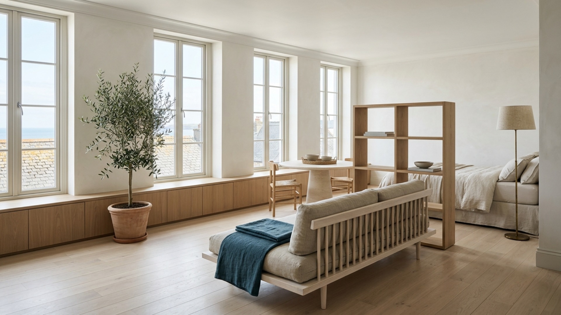
Give the studio two or three clear zones and mark them with things you can see over. A daybed with its back to the room, a low open backed shelf unit at around 90cm, or a change in rug all define a boundary without building a wall. The rule that matters: nothing used as a divider should be taller than 110cm, because anything higher stops the sightline and cuts the volume of the room in half.
-
02
Take the wall colour across every surface, including the kitchenette
In a studio the kitchen units are usually the loudest object in the room, and painting them the same warm off white as the walls makes them recede almost entirely. Farrow and Ball Slipper Satin or Benjamin Moore White Dove on walls, ceiling, woodwork, and cabinet fronts is roughly a weekend of work and 200 dollars of paint, and it does more than any furniture purchase available at that price.
-
03
Get everything possible off the floor and under 110cm
Visible floor is what a studio has instead of square metres. Wall mount the bedside light, the desk lamp, and the television, choose a sofa and bed on legs rather than sitting flush, and replace the tall bookcase with a long low run of storage under the window. A room where you can see the floor continuing under the furniture reads as substantially larger than the same room with skirted furniture in it.
-
04
Use one large rug per zone rather than several small ones
Small rugs chop a studio into pieces, which is the opposite of what you want. Use one large flat weave seagrass or wool rug to define the living zone, running under the front legs of the seating, and if the sleeping area needs separating, a second large rug rather than a runner. Two large rugs read as two rooms. Five small ones read as clutter on a floor.
-
05
Test the zoning in Framehouse before you move a single piece
Studio layouts are unusually sensitive to small changes, and the difference between a daybed facing the window and the same daybed turned ninety degrees is often the difference between a room that works and one that does not. Photograph the studio from the entry corner and use Framehouse to try two or three zoning arrangements before you commit. It costs nothing and it saves an afternoon of dragging furniture across a floor you probably want to keep unmarked.
Built for studio maximization
Moves that pay off
Maximizing a studio is mostly subtraction. Almost every worthwhile move here removes something rather than adding it.
- Measure the ceiling height before buying anything tall. Under 2.6m, nothing should exceed 110cm except the wardrobe.
- Paint the kitchenette to match the walls before you consider replacing any furniture.
- Sell the tall bookcase. It is almost always the single biggest cause of a studio feeling small.
- Choose one wardrobe and make it excellent rather than three pieces of storage scattered around the room.
- Keep the window wall clear. A studio reads by its longest sightline, and that is usually toward the light.
- Skip convertible furniture unless the room genuinely cannot work otherwise. Mechanisms are a maintenance cost, not a layout solution.
coastal cues
What to keep, what to skip
Coastal earns its place in a studio because it is a low contrast style, and low contrast is what makes a small room read as one volume.
- Palette: chalky off white across walls, ceiling, and cabinetry, oatmeal and soaped oak in the furniture, one petrol blue accent.
- Materials: limewashed plaster, soaped oak, bleached ash, honed pale limestone, washed linen, woven rush, aged brass.
- Signature: one continuous colour from wall to woodwork to kitchen units, so the boundaries between surfaces soften.
- Scale: low and open. Slatted frames, legs rather than plinths, and open backed shelving instead of solid carcasses.
- Texture: rush, linen, and jute providing the interest that pattern would provide in a room with more space to spare.
- What to skip: nautical motifs, tall dark bookcases, small scatter rugs, and any furniture that folds out of a cupboard.
Use it for
What people plan with Framehouse
- Try two or three zoning layouts before you move any furniture
- See how the kitchenette reads painted to match the walls
- Check whether a daybed works better facing the window or the room
- Size one large rug against the living zone instead of guessing
- Show a flatmate or partner the layout before you commit to it
Quick answers
Common questions
Make a plan you can act on
Skip the spiral of mood boards. Three minutes in the Aura Quiz turns your taste into a direction.
Take the Aura Quiz