Mid Century Modern Living Room Ideas for Studio Maximization
In a studio, the living room is not a room, it is a zone with three jobs and no walls. Mid century modern happens to be the best toolkit ever designed for exactly that problem.
The real problem
Why this is harder than it looks
The standard studio mistake is buying a living room set designed for a house and wondering why the apartment disappeared. A deep sectional, a bulky media console, a coffee table sized for a family of five: each piece works alone, and together they eat the floor and block the light. The living zone ends up feeling like a furniture showroom aisle rather than a place to sit.
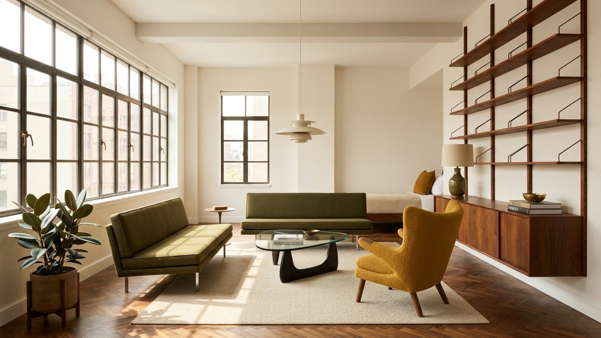
Mid century modern was designed for the opposite condition. The style came out of small postwar apartments and tract houses, which is why its signature pieces sit low, ride on tapered legs, and keep daylight moving underneath them. A Wegner-style sofa on legs shows the floor running beneath it, and a room where you can see the floor reads larger than one where you cannot. This is not styling trivia, it is the whole reason the style works so well in studios.
Maximization is really a zoning problem. Without walls, the living area has to declare its own edges, and mid century gives you the tools: a rug that holds the seating, a low credenza as a soft boundary, a pendant that marks the zone from above. Done right, the studio stops being one confusing room and becomes three legible ones that happen to share air.
The failure pattern is shrinking a big-house formula instead of changing the formula: a mini sectional, a mini media wall, everything pushed against the perimeter with a dead pool of space in the middle. Perimeter layouts feel bigger on paper and smaller in person. Pull the seating onto the rug, float the sofa, and let the walls hold storage instead of furniture backs.
A clear path
How to plan it
-
01
Define the living zone with a rug before buying furniture
Start with an 8x10 rug, not a 5x8, and let it claim the living zone outright. All four legs of the seating should land on it. A rug that is too small splits the zone visually and makes everything on it feel like a raft; the bigger rug is the cheapest square footage you will ever buy.
-
02
Choose low, leggy pieces and float them
Pick a sofa with a low back and visible tapered legs, around 78 inches, not a sectional, and float it at the rug's edge facing the window rather than jammed to a wall. Add one real chair, a Wegner-style lounge or a vintage armchair, angled toward it. Low backs keep sightlines open across the whole studio, which is what makes it feel like an apartment rather than a corridor.
-
03
Move storage off the floor and onto the wall
A wall-mounted teak shelving system, whether vintage Cado or a new String setup, holds books, records, and the TV without spending an inch of floor. Below it, one long low credenza around 60 inches does the work of three bulky units. Anything that touches the floor should earn it.
-
04
Light the zone at three heights
One pendant or arc lamp over the seating marks the zone from above, one table lamp on the credenza warms the middle, and one small lamp low in a corner stretches the room at night. All three warm, 2700K. A single overhead bulb flattens a studio into one sad plane; three heights give it depth that costs about $150.
-
05
Test the whole layout in Framehouse before you order
Studio layouts fail in inches: a sofa two inches too deep or a credenza four inches too long changes the walkway. Photograph your studio and test the floated sofa, the rug size, and the walnut tones together in Framehouse before committing. Seeing the zone drawn in your actual room beats any floor-plan app guess.
Built for studio maximization
Moves that pay off
Maximizing a studio is about making every piece do two jobs and letting sightlines stay open. The moves below are where the square footage actually comes from.
- Zone first, shop second: rug, pendant, and credenza define the living area before any seating arrives.
- Every piece earns its floor contact: wall-mount the storage, choose legs over plinths.
- Keep backs low so no piece blocks a sightline across the studio.
- Buy the 78-inch sofa, not the sectional. The corner seat costs more space than it gives.
- Let the credenza double as media unit, bar, and zone boundary.
- Measure walkways at 30 inches minimum and test the layout before ordering.
mid century modern cues
What to keep, what to skip
Mid century modern is the rare style where the iconic pieces were literally designed for small rooms. Stay close to these cues.
- Palette: warm white walls, walnut and teak, oatmeal and olive textiles, one mustard accent.
- Materials: oiled walnut, cane, wool, smoked glass, brushed brass in small doses.
- Signature: tapered legs on everything, daylight running under every major piece.
- Lighting: one sculptural pendant like a PH5, plus warm lamps, never a ceiling grid.
- Restraint: one statement chair, not a museum of them; three objects per shelf.
- What to skip: full matching sets, reproduction overload, orange-heavy 70s kitsch, bulky sectionals.
Use it for
What people plan with Framehouse
- Test an 8x10 rug against your real floor plan before buying.
- See a floated sofa layout against your actual window wall.
- Compare walnut against teak tones in your studio's light.
- Check whether a wall shelving system clears your ceiling height.
- Show a partner the zoned studio before moving day.
Quick answers
Common questions
Make a plan you can act on
Skip the spiral of mood boards. Three minutes in the Aura Quiz turns your taste into a direction.
Take the Aura Quiz