Minimalist Studio Apartment Ideas for an Open Plan Layout
An open plan studio fails when everything floats in one undifferentiated pool of space. Minimalism fixes it by using emptiness as the wall, and this page shows exactly where the emptiness goes.
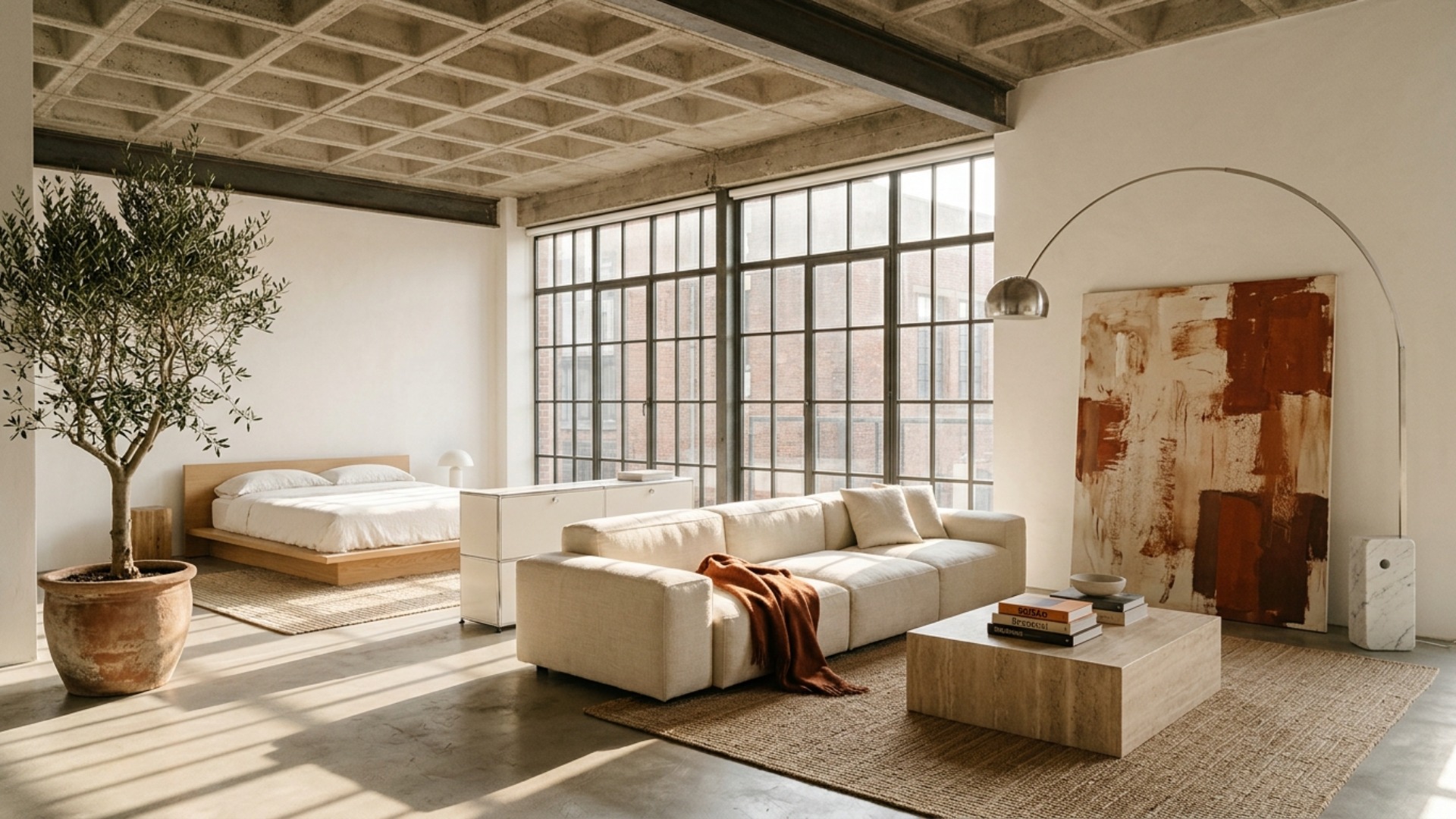
The real problem
Why this is harder than it looks
The open plan studio is sold as freedom and lived as formlessness. Most people respond by buying more furniture to fill the space, then arranging it in a loose cloud, and the result is a room that feels like a furniture showroom after hours: everything present, nothing anchored, and the bed on display from the front door.
The minimalist reading of the same room is different. Openness is not the problem; undifferentiated openness is. A single volume works when it is divided into zones by things that are not walls: a rug edge, a change in furniture height, a sightline that stops at a deliberate object. Minimalism is the right tool because every one of those boundaries needs visual quiet around it to register.
Your starting point is usually a rectangle with windows on one short side and a kitchen along one wall, which means the room wants to become one long corridor of stuff. The job is to break the corridor into three or four zones, sleeping, living, eating, working, while keeping the eye able to travel the full length of the space. Openness preserved, chaos removed.
The failure pattern is the divider reflex: a bookcase across the middle, a curtain on a track, a folding screen. Each one buys privacy at the cost of light and makes the studio feel like two small rooms instead of one generous one. Minimalist zoning keeps everything below eye level and lets the floor plan breathe.
A clear path
How to plan it
-
01
Draw the zones on the floor before touching furniture
Give each function a rectangle and let the rectangles share edges: sleep in the corner farthest from the door, living at the windows, eating or working along the remaining wall. A roll of painter's tape on the floor makes the plan physical, costs $6, and kills more bad layouts than any amount of staring at the empty room.
-
02
Let two rugs do the work of the missing walls
A large flatweave under the living zone and a smaller one beside the bed establish boundaries the eye respects without blocking an inch of light. Size matters more than pattern: the living rug should hold the sofa's front legs and the whole coffee table. Two rugs, both quiet, both rectangular, and the zones appear.
-
03
Zone with height: everything low except one marker
Keep every piece in the middle of the room below roughly 30 inches, a low sofa, a low bed, a low table, so sightlines run uninterrupted. Then allow exactly one tall element, a slim floor lamp or a single olive tree, to mark the corner where zones meet. One vertical in a low room reads as architecture.
-
04
Place one boundary piece instead of a divider
A low sideboard or console, around 28 inches high, set perpendicular behind the sofa is the minimalist wall: it separates sleeping from living, adds the studio's missing storage, and never touches the light. Skip bookcases, curtains, and screens entirely. If a boundary needs to be taller than the sofa back, the layout is wrong, not the furniture.
-
05
Prove the layout in Framehouse before rearranging your life
Open plan mistakes are heavy: a sofa in the wrong zone means moving everything twice. Framehouse renders your actual studio in a minimalist scheme so you can compare the bed against the far wall versus behind a console, and see whether the room reads as zones or as a corridor, before you shift a single piece.
Built for open plan fix
Moves that pay off
An open plan studio rewards discipline about boundaries more than any purchase. Start with these.
- Never let the front door sightline land on the bed. Angle the plan so it lands on the living zone.
- Put the zone boundaries where the architecture already hints: a beam, a window break, a ceiling change.
- Buy the large rug first and place it before choosing any furniture around it.
- Keep a 36 inch walking channel clear from door to window. The corridor is a feature, not wasted space.
- Resist symmetric arrangements. Zones read more clearly when their weights differ.
- Leave one zone deliberately underfilled. The empty quarter is what makes the rest feel intentional.
modern minimalist cues
What to keep, what to skip
Minimalism in an open plan is a sightline discipline. These cues keep the single room coherent.
- Palette: one warm neutral family across all zones, so the eye reads one room, not a patchwork.
- Materials: white oak, linen, wool, and one mineral surface like travertine or honed stone.
- All seating and sleeping below 30 inches; one tall sculptural element per room, maximum.
- One structural signature: an arched floor lamp or a single oversized leaning canvas.
- Storage closed and low: sideboards over shelving, drawers over baskets, nothing stacked.
- What to skip: room dividers, curtain tracks, tall bookcases mid floor, and accent walls that chop the volume.
Use it for
What people plan with Framehouse
- Test whether the bed hides from the front door before moving it
- Compare one large rug against two smaller ones in your actual footprint
- See if a low console genuinely separates sleep from living in your room
- Check that the walking channel stays clear with the sofa in place
- Show a partner the three zone plan before the furniture gets heavy
Quick answers
Common questions
Make a plan you can act on
Skip the spiral of mood boards. Three minutes in the Aura Quiz turns your taste into a direction.
Take the Aura Quiz