Minimalist Living Room Ideas Using Only IKEA
An IKEA-only living room fails when you buy the icons and succeeds when you buy the quiet pieces. This page is the minimalist shopping and styling plan: which lines to use, which to skip, and how to keep the result from looking like aisle 12.
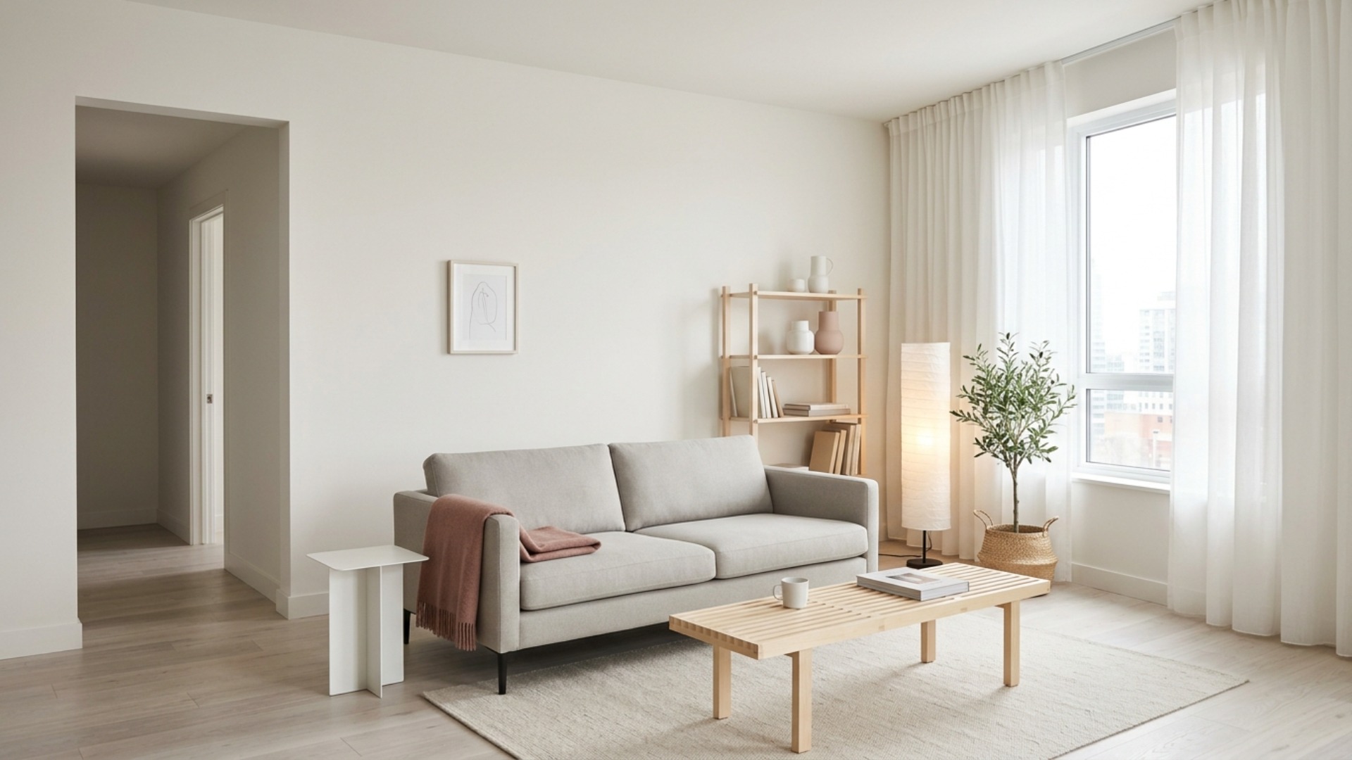
The real problem
Why this is harder than it looks
The reflex is to apologize for an all-IKEA room, and it is misplaced. Minimalism is the one style where IKEA competes above its price, because the style asks for exactly what flat-pack does well: simple forms, pale woods, and repetition. What gives an IKEA room away is never the furniture. It is the shopping pattern.
The usual failure is buying the icons. The Kallax wall, the Lack tables, the glossy Besta fronts: these pieces are in several million living rooms, and the eye recognizes them instantly. The catalog looks minimalist in photographs because a stylist restrained it; the store path is designed to send you home with eleven impulse objects that undo the look by Saturday night.
The second failure is finish drift. IKEA sells the same shapes in white, birch effect, oak effect, walnut effect, and black-brown, and a cart assembled over three trips usually contains four of them. Nothing says flat-pack faster than five almost-matching woods in one room.
The fix is to shop it like a system: one wood finish, one upholstery tone, the quiet lines instead of the famous ones, and most of the budget pushed into the two things that read from the doorway, the sofa and the rug. Restraint is free, which makes it the best value in the store.
A clear path
How to plan it
-
01
Shop the quiet lines, not the icons
Build around the pieces that do not announce themselves: a Soderhamn or Vimle sofa in a pale grey or beige, Listerby or Stockholm tables, and Ivar pine shelving left simple. Skip Kallax, Lack, and anything high gloss. The famous pieces are famous because everyone has them.
-
02
Commit to one wood finish in the cart
Pick birch or light oak effect and hold every piece to it, including the frames and the shelf brackets. IKEA's finishes do not quite match across families, and a room that mixes three of them reads as accumulation. One finish repeated is what makes a budget room look decided.
-
03
Spend the difference on textiles
The sofa and shelving savings go into a wool or flatwoven rug, the largest that fits the seating zone, and linen curtains hung at the ceiling rather than the window frame. Textiles are where IKEA quality is genuinely strong, and they are what make the hard furniture look intentional.
-
04
Style with a hard object limit
Ten visible objects in the whole room is a working ceiling: one throw, a short run of books, two or three ceramics, one large plant in a plain basket. The store will sell you forty small things on the way to the register; the minimalist result depends on leaving them there.
-
05
Visualize the cart before checkout
Photograph your actual room and test the sofa, shelving, and rug combination in Framehouse before ordering. Seeing the pieces at true scale in your light is the difference between a room that looks planned and a Saturday of returns.
Built for ikea only design
Moves that pay off
An all-IKEA room is a constraint worth embracing, and it rewards sequencing like any other budget:
- Set the ceiling around 1,500 to 3,000 dollars all-in. Past that, mixing in one non-IKEA vintage piece beats upgrading within the catalog.
- Buy the sofa and rug first and live with them a week before the second order. They set the tone every other piece must match.
- Use wall-mounted Besta with matte fronts for closed storage, hung high enough to keep floor visible.
- Swap the stock legs and handles on storage pieces for wood or matte black ones. Ten dollars of hardware removes most of the flat-pack tell.
- Keep boxes and receipts for the first month. The pieces that feel wrong in your light can go back; most people keep the wrong ones out of inertia.
- Skip the as-is section for this room. It seeds exactly the finish drift the plan is trying to prevent.
modern minimalist cues
What to keep, what to skip
Modern minimalist with a flat-pack catalog is a discipline of leaving out, and these are the cues that hold it together:
- Palette of soft white walls, one pale wood effect, one light upholstery tone, and a single muted accent such as dusty rose or clay in textiles only.
- Low, track-arm or slab-sided seating. Nothing tufted, nothing reclining, nothing with visible mechanisms.
- Sheer curtains ceiling to floor on the whole window wall. It is the cheapest architectural move in the store.
- Closed storage below eye level, one open shelf styled sparsely above.
- Texture from wool, linen, and seagrass instead of pattern or print.
- Skip high gloss fronts, mirrored furniture, and the seasonal decor aisle entirely. Each is a style reset in a bag.
Use it for
What people plan with Framehouse
- Test an IKEA sofa and rug pairing in your real room before ordering
- See whether birch or oak effect reads better on your floor
- Check a wall of sheer curtains against your window before buying
- Compare two shelving layouts before committing the wall
- Show a partner the finished IKEA-only plan before the store trip
Quick answers
Common questions
Make a plan you can act on
Skip the spiral of mood boards. Three minutes in the Aura Quiz turns your taste into a direction.
Take the Aura Quiz