Scandinavian Bedroom Ideas Using Only IKEA
IKEA already sells the Scandinavian bedroom, which is exactly why an all-IKEA room so often ends up looking like a showroom instead of a home. This page covers which pieces are worth buying, which to walk past, and the small changes that make a catalogue bedroom read as yours.
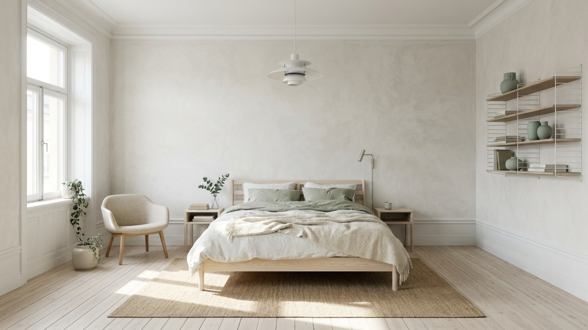
The real problem
Why this is harder than it looks
IKEA and Scandinavian design share a country of origin, so people assume the two are the same thing and that buying Swedish automatically produces a Swedish room. It does not. IKEA sells the vocabulary of the style at volume, pale wood, white lacquer, simple lines, and the volume is precisely the problem. Furnish a bedroom entirely from one catalogue and you get consistency without character, which is why an all-IKEA room often photographs well and feels flat to stand in.
What is actually going on is that real Scandinavian interiors are not defined by their furniture. They are defined by light management and material contrast: a lot of white to bounce a weak northern sun, then a small number of textures with real weight, undyed wool, raw linen, unlacquered wood, hand-thrown ceramic, to keep all that pale from turning clinical. IKEA is excellent at the first half and thin on the second. Its textiles skew synthetic and its wood finishes skew uniform, and uniformity is the enemy here.
So the job in an IKEA-only bedroom is not to find better furniture. It is to spend the budget unevenly. The bed frame, wardrobe, and shelving can be the cheapest versions in the store, because their job is to be quiet. Everything you touch or see up close, bedding, throw, rug, lampshade, should take the largest share, because that is where the material contrast lives and the only place anyone can tell what a room cost.
The failure pattern is buying a matched set. MALM bed, MALM nightstands, MALM dresser, all in the same white stain, and the room reads as a hotel that ran out of budget halfway through. Break the set on purpose. Mix one wood tone with one painted piece, let the two nightstands be different from each other, and leave a wall bare rather than filling it with the frame multipack that was on the way to the checkout.
A clear path
How to plan it
-
01
Lock one wood tone and one wall colour before you open the catalogue
Decide in advance whether the room is birch and white or oak and greige, then refuse anything outside it once you start browsing. IKEA's wood-effect finishes vary noticeably between ranges, and a birch-effect bed next to an oak-effect wardrobe reads as a mistake rather than a considered mix. For the walls, a chalky warm white such as Benjamin Moore Chantilly Lace keeps the pale palette from turning grey under a north-facing window.
-
02
Buy the frame cheap and the mattress properly
A MALM or NEIDEN frame at under $250 disappears the moment it is dressed, so there is no return on spending more there. Put the money into the mattress and a solid slatted base instead, since those decide whether the room is actually pleasant to be in. If you want the low, floating look the style is known for, NEIDEN in untreated pine, sanded and oiled at home for about $20 of materials, looks better than any of the lacquered options above it.
-
03
Put most of the textile budget into bedding and one large rug
This is the single decision that separates an IKEA bedroom from a Scandinavian one. Skip the polyester-blend duvet sets and buy the washed linen instead, DYTAG or PUDERVIVA, in white or a muted grey-green, then layer one undyed wool or heavy cotton throw across the end of the bed. Add a flatweave wool or jute rug big enough that the front two thirds of the bed sits on it, usually 200 by 300 cm, which is a size larger than most people instinctively buy.
-
04
Change the lighting, or at minimum the shades
IKEA lighting is where the catalogue look is hardest to shake and also the cheapest thing to fix. Get the ceiling fitting onto a simple paper or opal glass shade, use a clip-on or wall-mounted reading light on each side of the bed rather than a matching pair of table lamps, and put everything on 2700K warm bulbs. Cool white bulbs will make every pale surface in the room look grey no matter which white you painted the walls.
-
05
Visualize the room before you load the trolley
An IKEA run is close to a one-shot decision: the flat pack goes home, gets built, and rarely goes back. Photograph the empty bedroom and use Framehouse to see the wall colour, the wood tone, and the rug size together before you commit, because pale wood against pale walls is nearly impossible to judge from a swatch and a product page. Getting scale right on screen costs nothing, and scale is the most common regret.
Built for ikea only design
Moves that pay off
An IKEA-only room is a constraint rather than a compromise, but it rewards a different order of operations than a normal furnishing project.
- Measure the room and tape out the bed, wardrobe, and walkway on the floor before your first trip. IKEA's published dimensions are honest and your memory is not.
- Build the room across two visits, not one. The first buys the bed, wardrobe, and rug, the second buys lighting and textiles once you can see what the room is missing.
- Buy proper wall anchors separately for anything tall. The included hardware is the weakest part of the PAX and BILLY ranges and the tip-over risk is real.
- Walk past the checkout styling entirely. The vases, faux stems, and frame multipacks by the tills are exactly what make an IKEA room look like an IKEA room.
- Leave one category deliberately unbought for a couple of months and fill it secondhand, usually art or a bench, so the room has one thing that did not arrive flat.
- Keep the receipts and the boxes for a week. The return window is generous and the most common regret is scale, which only becomes obvious once the piece is standing in the room.
scandinavian cues
What to keep, what to skip
Scandinavian design is a light strategy before it is a look, and these are the cues that carry it.
- Palette: chalky warm white on the walls, undyed wool and raw linen in the textiles, one pale wood used consistently, and a single muted accent such as sage, clay, or soft black.
- Materials: unlacquered or lightly oiled wood, wool, linen, jute, matte ceramic. Anything high gloss reads as budget contemporary rather than Scandinavian.
- Structural signature: low furniture and a clear sightline to the window. Nothing tall sits between the bed and the main light source.
- Contrast comes from texture, not colour. A room with five shades of off-white and five different surface finishes is doing it correctly.
- Warmth is not optional. 2700K bulbs, one wool layer, and at least one living plant keep the pale palette from reading as a clinic.
- What to skip: matching furniture sets, faux fur, word art, cool blue-white paint, and anything with hygge or farmhouse in the product name.
Use it for
What people plan with Framehouse
- Check whether a 200 by 300 cm rug actually fits before you carry one home
- Test chalky warm white against your existing floor colour before buying paint
- Compare a low pine frame and a white lacquer frame in the same room
- Show a partner what the finished bedroom looks like before the IKEA trip
- Decide whether the wardrobe belongs on the window wall or opposite it
Quick answers
Common questions
Make a plan you can act on
Skip the spiral of mood boards. Three minutes in the Aura Quiz turns your taste into a direction.
Take the Aura Quiz