Scandinavian Studio Apartment Ideas for an Awkward Layout
A studio with an odd shape is not a problem to hide, it is the thing your whole plan should answer to. Scandinavian design zones a single room with light and rugs instead of walls, which is exactly what an awkward layout needs.
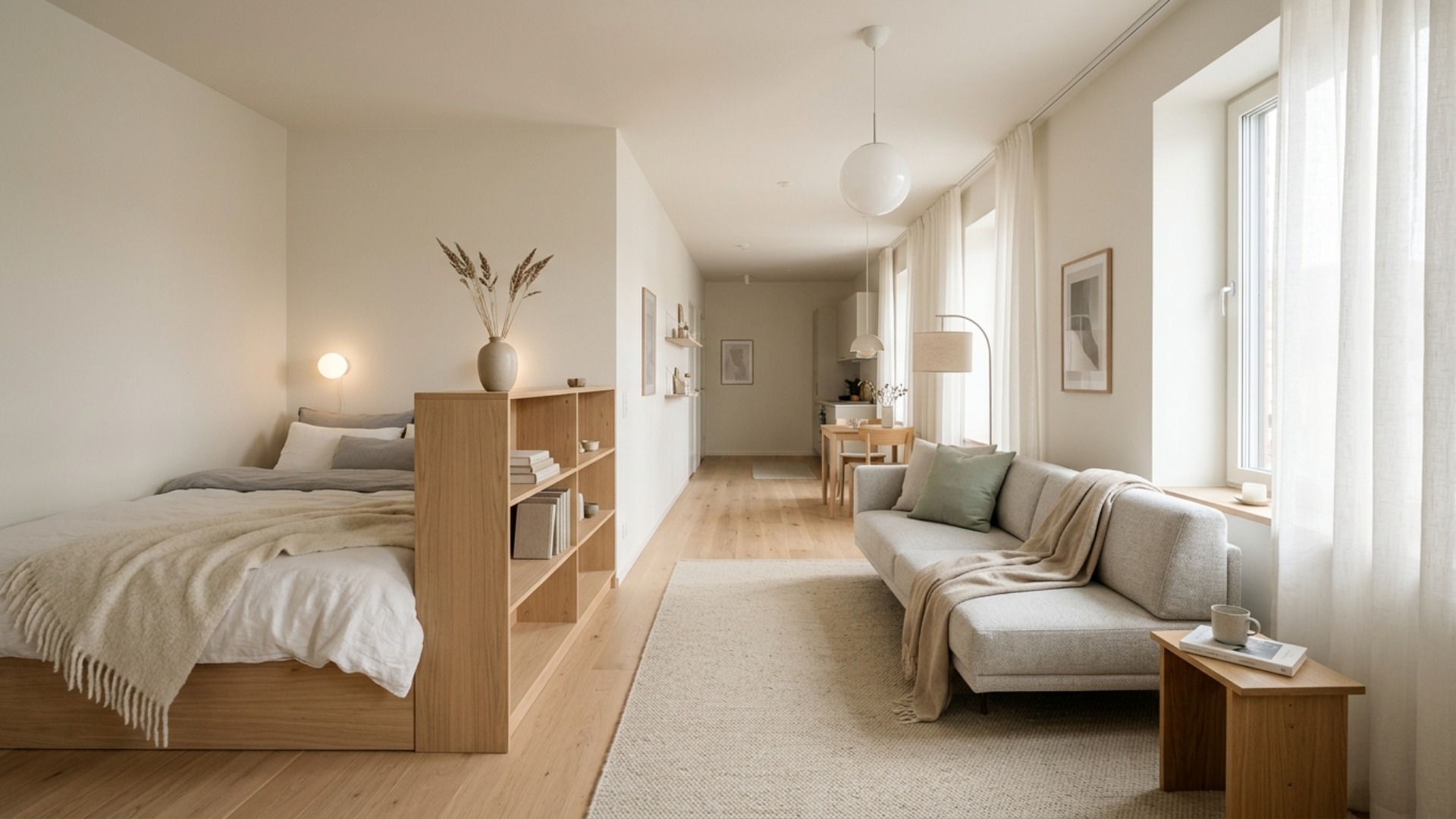
The real problem
Why this is harder than it looks
Most people read Scandinavian as white walls, blonde wood, and a few IKEA pieces. In a studio with an awkward layout they paint everything white, line the walls with flat-pack furniture, and end up with something that feels like a dorm rather than the airy Copenhagen apartment they pinned. The look is there on paper and the warmth is missing.
What is actually going on is that Scandinavian design is about light, texture, and a considered relationship between a few pieces. The awkward layout, a long narrow room, a slanted wall, a column, an entry that opens straight onto the bed, is not a flaw to disguise. It is the constraint the plan should be built around, and Scandinavian handles it unusually well because it zones with rugs and light rather than walls.
Your real starting point is that one room has to sleep, work, feed, and host you, and the obvious furniture arrangement fights the shape. You are fighting the room instead of reading it. The fix is to find the room's natural logic first, then furnish to it.
The failure pattern is pushing every piece against the walls to open up the middle, which actually makes the awkwardness louder and leaves a dead zone in the center. The other version is buying one bulky sectional that only fits in the single wrong orientation. Scandinavian studios do the opposite: they float and zone.
A clear path
How to plan it
-
01
Map the room's real zones before you buy a thing
Every awkward studio has a natural logic once you stop fighting it. Put the bed in the most enclosed or darkest corner, the sofa and work zone near the light, and let the awkward niche become storage or a desk nook. Tape the furniture footprint on the floor before you spend, because the wrong sofa is the most expensive mistake in a small space.
-
02
Define zones with two rugs and one low piece
In a studio you separate functions with a large flat-weave rug under the living area and a smaller one by the bed, plus a single low piece between them. An IKEA KALLAX turned on its side at about 30 inches high divides sleep from living without blocking light. Scandinavian zoning is visual, not structural, so nothing needs to reach the ceiling.
-
03
Warm the white with oak, wool, and one soft color
All-white reads cold and dorm-like. Keep the walls in a warm white like Farrow and Ball Wimborne White, then bring in light oak or ash furniture, a wool throw, linen curtains, and one muted accent such as sage or dusty clay. The warmth in the wood and textiles is what makes the room read as Scandinavian rather than sterile.
-
04
Pick leggy, dual-purpose pieces that show the floor
In an awkward studio, furniture on visible legs keeps the floor plane readable and the room feeling larger. A storage bed, a nesting or lift-top coffee table, and an extendable table that doubles as a desk and a dining spot all earn their footprint twice. Avoid anything skirted to the floor or a piece that only works in one orientation.
-
05
See the arrangement in Framehouse before the furniture arrives
An awkward layout is exactly the case where a floor plan lies and a photo tells the truth. Framehouse renders your studio in Scandinavian so you can test whether the bed reads better in the corner or along the window, and whether a loveseat or a full sofa fits the shape, before a large delivery you cannot easily return.
Built for awkward layout
Moves that pay off
An awkward layout rewards planning over shopping. Work with the room's real shape and let a few flexible pieces do several jobs.
- Tape the furniture footprint on the floor before ordering. A returned sofa is the most expensive lesson in a small space.
- Put the bed in the darkest or most tucked-away corner, and give the light to the living and work zones.
- Let the awkward niche, alcove, or column earn its keep as storage, a desk, or a reading nook.
- Choose one larger sofa over two small chairs. Scale reads as calm, while many small pieces read as clutter.
- Float at least one piece off the wall. Pushing everything to the edges makes the awkwardness louder, not quieter.
- Add a mirror opposite the window to double the light, which is the whole point of Scandinavian.
scandinavian cues
What to keep, what to skip
Scandinavian is light, pale wood, and soft texture with a restrained palette. Get the warmth right and it never reads as cold minimalism.
- Palette: warm white, pale wood, soft grey, and one muted accent like sage or clay. No stark black and white.
- Materials: light oak or ash, wool, linen, and a little rattan or paper for texture.
- Light is the hero: sheer linen at the windows, layered lamps, and nothing blocking the daylight.
- One structural signature: a simple paper or opal-glass pendant, or a single arc floor lamp.
- Texture over pattern: a chunky wool throw and a flat-weave rug carry more than any print.
- What to skip: heavy dark wood, ornate detail, and the all-white dorm look. Warmth is the difference.
Use it for
What people plan with Framehouse
- Test whether the bed reads better in the corner or along the window before moving anything heavy
- See if a full sofa or a loveseat actually fits your awkward shape
- Compare a warm white against a cooler one on your real walls and light
- Show a roommate or partner how the zones will divide the single room
- Decide which awkward corner becomes the desk and which becomes storage
Quick answers
Common questions
Make a plan you can act on
Skip the spiral of mood boards. Three minutes in the Aura Quiz turns your taste into a direction.
Take the Aura Quiz