Brand Kit . Version 1.0 . Issued 2026

The Framehouse Identity
A small set of rules, held with care.
Framehouse . framehouse.design
Voice and Tone
How we sound.
Our voice is editorial. We treat the home as a serious subject, told with warmth and restraint.
Confident, not loud
We never shout. The work earns the room.
Editorial, not academic
We write like a great magazine. Considered, never stuffy.
Warm, not cute
Hospitality over cleverness. Restraint over winks.
Specific, not clever
A real detail beats a polished line, every time.
A rule we never break.
No em dashes. No en dashes. We use commas, colons, and periods. The pause should feel chosen, not borrowed.
Logo Mark
One letter. Held with intention.
Clear space
Maintain clear space equal to the cap height of the F on every side.
Minimum size
24px on screen. 0.4 inches in print. Below that, the serifs collapse.
Never
Do not stretch, recolor outside the palette, place on busy imagery, or rotate the mark.
Wordmark
Framehouse
Set in Playfair Display, weight 500. Letter spacing 0.04em at display sizes, 0.02em at body.
Always one word, capital F. Never Frame House. Never FH. The wordmark may sit alone, or to the right of the mark with one cap height between them.
Color
A palette of five.
Primary surface
Ink
HEX #0A0A0A
HSL 0, 0%, 4%
RGB 10, 10, 10
Primary type, soft surface
Bone
HEX #F5F5F0
HSL 60, 17%, 95%
RGB 245, 245, 240
Accent, rules, calls to action
Brass
HEX #C9A86C
HSL 37, 47%, 60%
RGB 201, 168, 108
Elevated surface
Charcoal
HEX #1A1A1A
HSL 0, 0%, 10%
RGB 26, 26, 26
Hairlines, dividers
Smoke
HEX #2A2A2A
HSL 0, 0%, 16%
RGB 42, 42, 42
Typography
Display . Serif
Playfair Display
Used for headlines, pull quotes, and editorial accents. Italic is reserved for emphasis and never for whole sentences.
Aa
Weights 400, 500, 600, 700 . Italic 400, 700
Text . Sans
Inter
Used for body, navigation, captions, and interface. Set with generous leading, 1.6 to 1.7 for body text.
Aa
Weights 300, 400, 500, 600
Display 72
Planning over guessing.
Heading 36
A small set of rules, held with care.
Body 16
Framehouse is for people who want their home to feel considered. We help them plan rooms with intention, then bring the plan to life.
Eyebrow 10
Chapter Six . Material Honesty
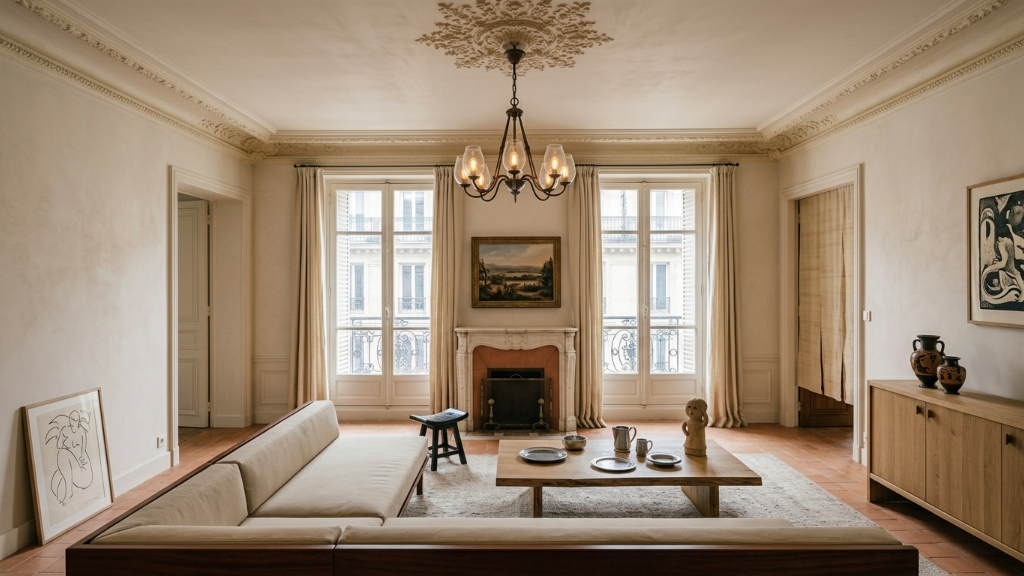
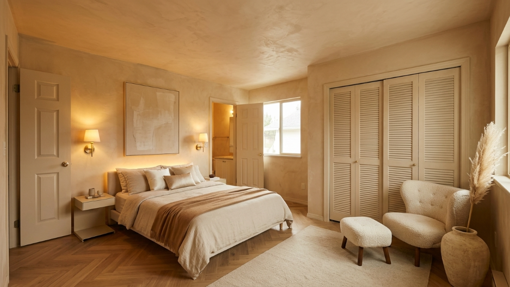
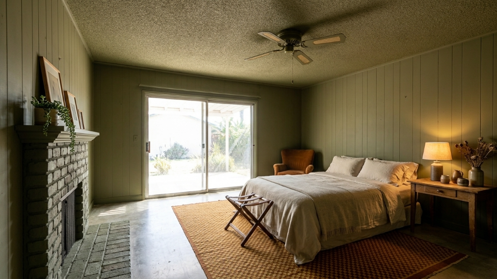
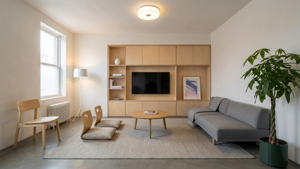
Photography
Rooms that look lived in.
Naming and Writing
Framehouse
One word, capital F. Never Frame House, never FH. The brand name is always set in regular weight, not bold.
Aura Quiz
Two words, both capitalized. Our primary entry point. Refer to it as the Aura Quiz, not "the quiz".
Punctuation
We do not use em dashes or en dashes anywhere in our copy. We use commas for breath, colons for arrival, and periods for finality.
Numbers
Spell out one through nine in body copy. Use numerals for ten and above, and always for data, prices, and percentages.
Downloads
Take what you need.



Colophon
Questions about the kit, or a use we have not covered?
hi@tryframehouse.comFramehouse Brand Kit . Version 1.0 . framehouse.design